Unbounce Inline Text Editor
Designed an elite text editing experience that allowed marketers to create on-brand campaigns.
Problem
Unbounce's text editor was dated and had a number of usability issues. This included editing out of the context of its surrounding elements, which resulted in the user switching back and forth between 'edit' and 'preview' mode. This unnecessary QA process took big chunks of their time and it made the building process longer.
Over the years, there have been thousands of support tickets around fonts and the text editor re: usability and bugs. The text editor code blocked us from building new functionality on it, which meant that we couldn't give our customers what they needed in order to achieve pixel perfection (e.g. web font integrations, paragraph styling, custom font sizes and line heights).
Goals
Give users the ability to add, edit, and style the text on their landing pages according to their brand style guide.
Solution
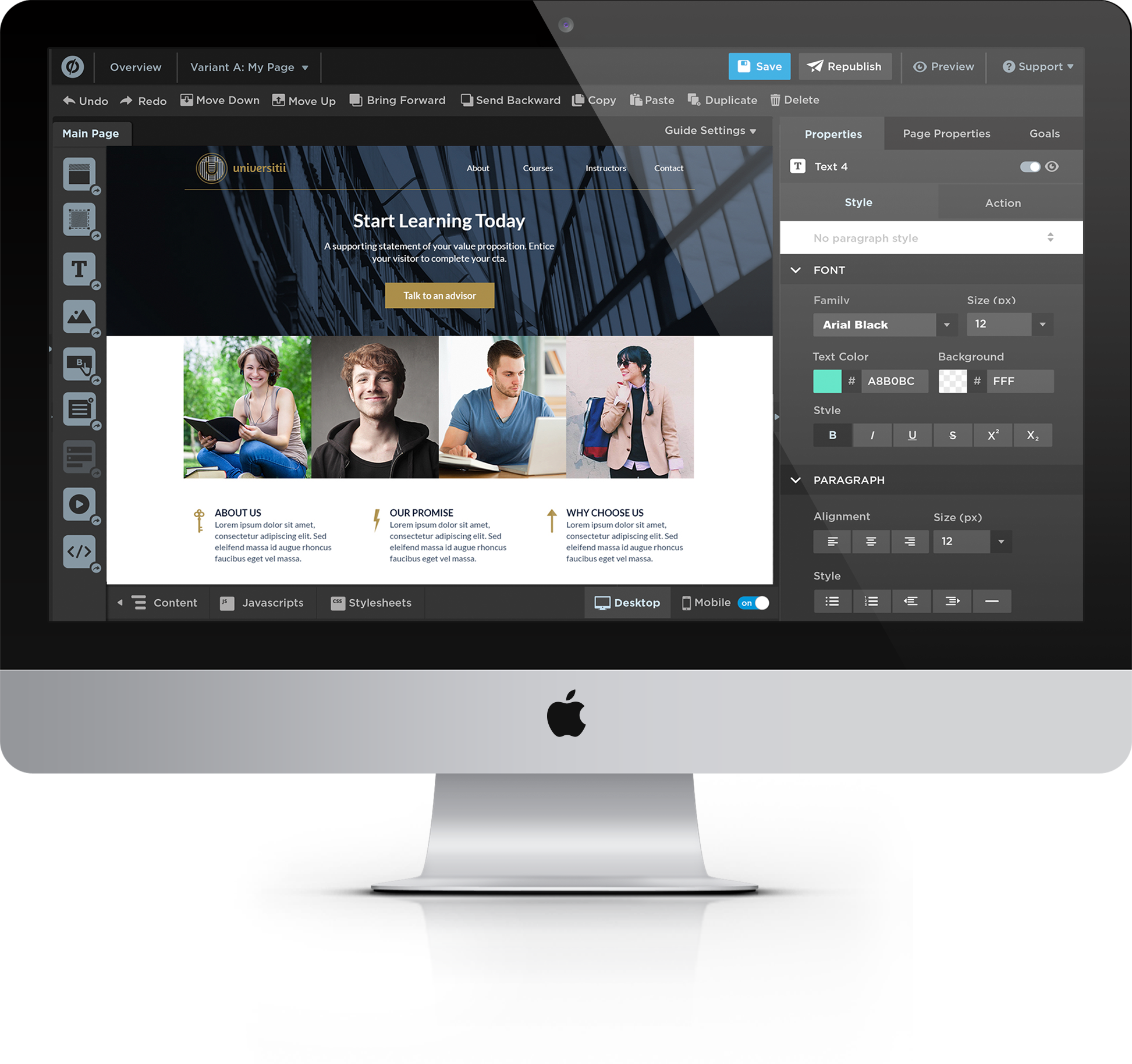
The Inline Text Editor (ITE) is an easy-to-use text editing tool that uses UI elements that users are already familiar with. Users are now able to edit content inline, which adds context to the editing process. They're able to see how their copy looks in relation to other page elements (e.g. images, forms, etc). Launching the ITE has also allowed us to give our customers what they've always asked for: the ability to add custom fonts without using code.
Product video created and sourced from unbounce.com
Results
When we launched the ITE to all of our customers, users had the opportunity to revert to the previous text editor before we completely retired it. The ITE had a 96% adoption rate, which meant that only 4% disabled it on their account. We received positive feedback from our customers.
Process
Research
The builder is Unbounce's bread and butter. Any feature that's launched in the app must be simple enough to use by anyone, especially one that will affect our entire customer base (e.g. text editing).
We examined our downgrade feedback and found that there was a recurring pattern of our customers feeling extreme frustration with the text editor. Comments such as "Your CMS is really bad at editing text, it's too hard to configure this and make it work" and "tried using the editor, found it too hard and time consuming to use," were common.
We took a look at the competitive landscape. From a product strategy perspective, we realized that both our direct and soft competitors were using inline text editing as a way to successfully show potential customers how easy-to-use their tool is.
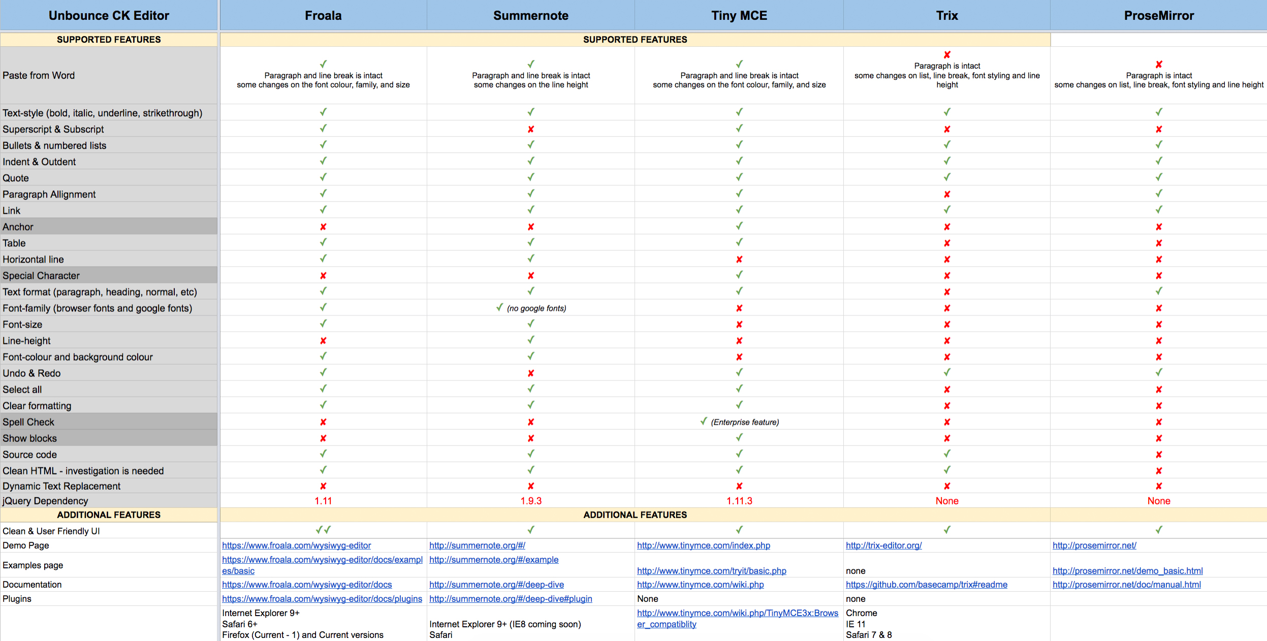
We started to look into inline text solutions that we can integrate into the builder. We listed out what features our current text editor had and compared it to editor plug-ins. This helped us understand each plug-in's technical limitations. We chose Froala because it best fit the needs of the app and it would allow us to have feature parity out-of-the-box.
Unpacking the problem
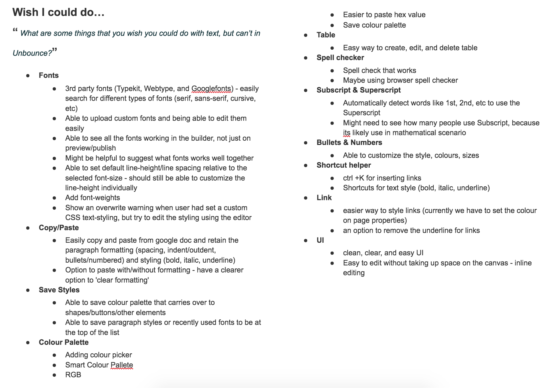
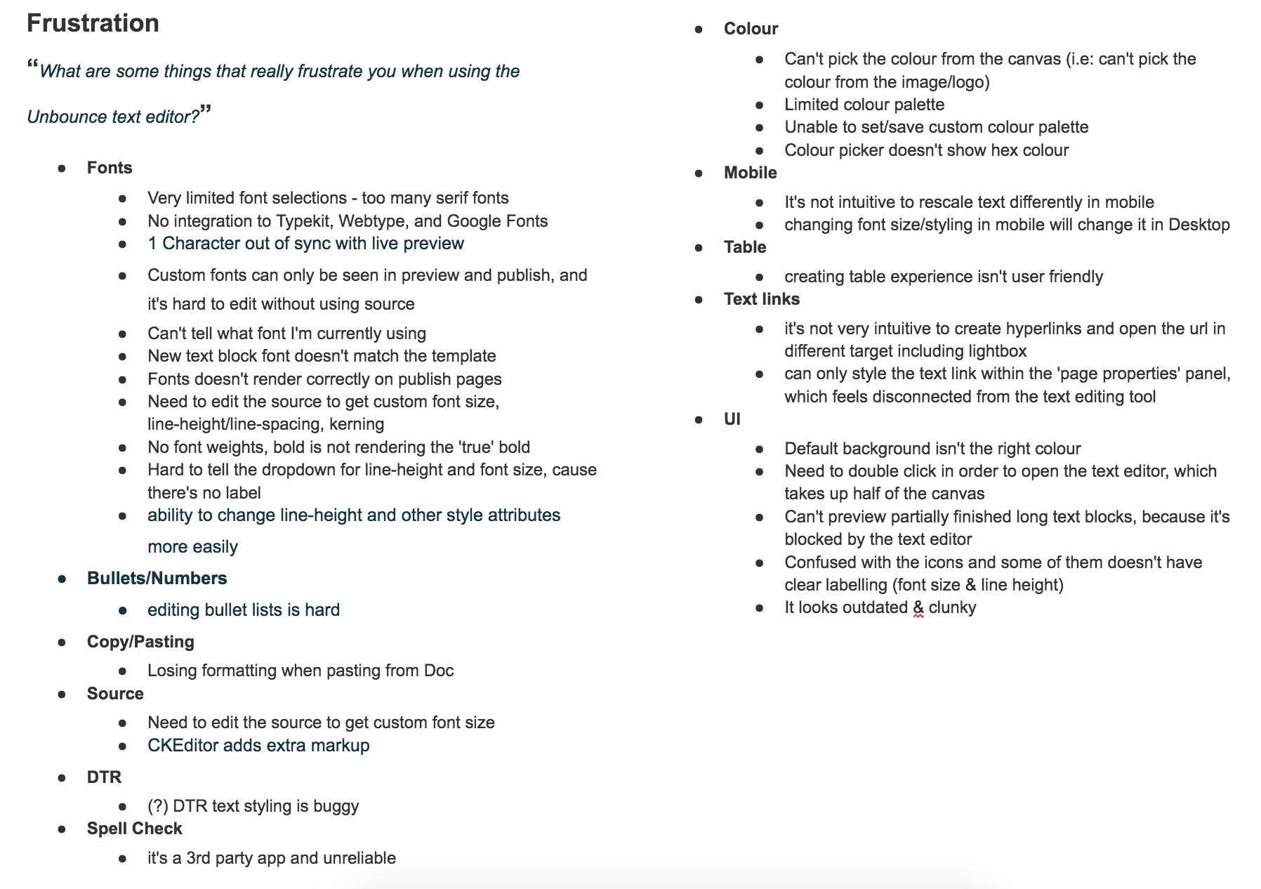
We invited internal stakeholders from various teams to an unpacking session. This is a great way to get different perspectives on a project. We were able to gain insights not only from our customers (through NPS feedback, downgrade feedback, support tickets, and community questions), but from internal users who used the builder everyday. We asked them two questions:
- What are some things that really frustrate you when using the Unbounce text editor?
- What are some things that you wish you could do with text, but can’t in Unbounce?
We wanted to dig deeper on our current text editor's usage. We asked our Product Data Analyst to track this information for us. Doing this early allowed us to make trade-offs in the design and technical implementation. We found that along with the font family, basic styling buttons (e.g. bold, italic, underline), font size and line height, source mode was being clicked quite often.
As a WYSIWYG editor, this intrigued us. Why were users going into soure mode so frequently? We formulated a hypothesis: Users go into the text editor's source mode because they aren't able to select custom font sizes and line heights in the menu. This later proved to be true when we conducted usability studies.
Phase 1: Inline Text Editor
We first explored the ITE as a floating toolbar wherein the user is able to write copy and style them on-the-go. After getting feedback from users, we realized that not only would this further clutter the editing area, but it would also be a completely new UI component.

After many whiteboarding sessions and technical discussions, we had the skeleton of the ITE. The UI was familiar to users -- the properties panel on the right side of the screen allowed users to control and manage their elements' style and function. We also had more real estate to organize the different text-related functions namely: Style, Action, and Information. We later decided not to include the Information section in the feature's MVP.
With this design, we created a paper prototype on giant stickies. We presented it to the engineering and UX team to get feedback, get alignment on the product vision, and understand technical limitations. This allowed us to show potential interactions and collaborate with the engineering team early.
Usability Study #1
While the engineering team was doing technical spikes on Froala and the proposed design, I ran a study using apps that had the functionaity we were looking into implementing in order to validate some ideas and get feedback for the ITE. Testing a static prototype would not have given me the feedback I needed. I created task-based scenarios for Readymag (colour swatches) and Keynote (colour swatches and paragraph styling).
KEYNOTE
Keynote is a native Apple application that allows users to create presentations. I wanted to understand how users would interact with Keynote's paragraph styles. Users are able to create master styles that lets users build presentations faster.
READYMAG
Readymag is an online publishing tool for users to create presentations and magazines. I wanted to see what users thought of the ability to add custom fonts in Readymag and what their expectations were when using custom fonts.
Mockups
Combining the research, usability study #1 feedback, data collected from the previous text editor, and the technical discovery work done by the engineering team, we had enough information to start designing high fidelity mockups.
We intentionally designed for the future. This included features like saving paragraph styles and colour swatches so that users can build their pages more efficiently. Understanding the feature's vision allowed us to define what MVP is. This guided us in critical design decisions we needed to make throughout the project.
Usability Study #2
We started developing a prototype in-app that we could test with users. As an empathy building exercise, I asked the engineering team to facilitate some of the sessions so that they could hear the user's feedback first hand.
With the data points from the study, I planned and facilitated an Empathy Map exercise with the engineering team, where we grouped the feedback into themes. The goal was to prioritize found bugs and possible feature improvements for the first release as a team.
Each coloured post-it corresponded to a participant in the study. Each sticky contained a data point from each participant. One of my goals was to include the developmers in the design process. This exercise was a visual way to show the team the summary of findings, without creating the work in silo and adding biases. We would refer to this empathy map continuously throughout the project to prioritize features.
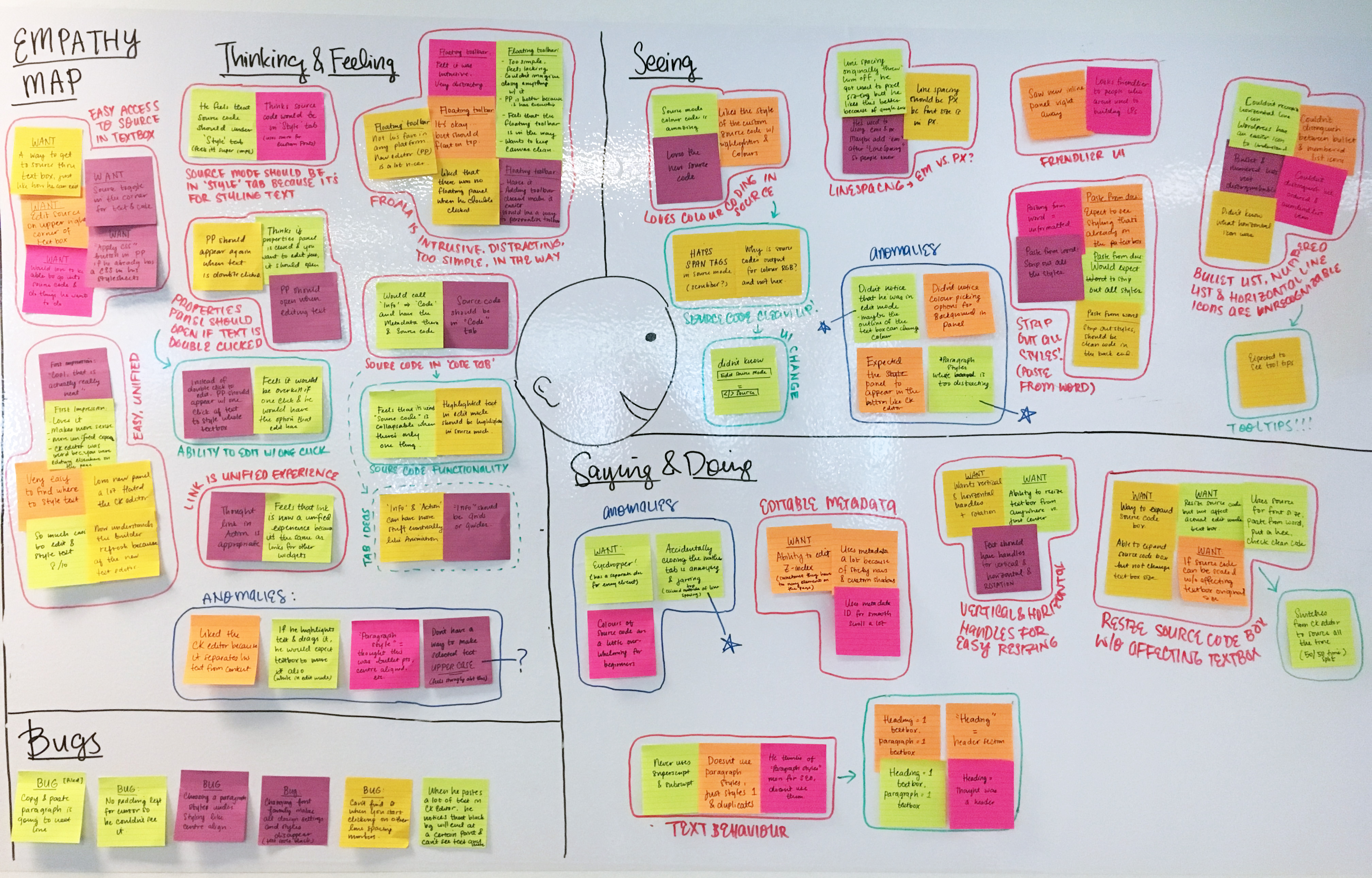
We learned that customers who belonged to agencies switched to the source mode quite often. They also cared about the quality of the code's final output because they would later hand the page off to their client as clean as possible. We asked ourselves: How might we clean up the unnecessary span tags in the source mode? How might we build and design a source mode that was quick to access and code that was readable?
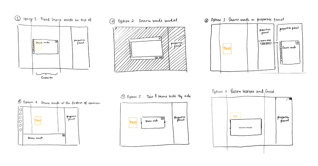
We were able to solve the problem as a team by whiteboarding potential ideas for this specific pain point. We decided to implement solution #2, a source mode built as a modal in the backend, but appears as a textbox to the user. The code autosaved, so if the user accidentally clicked out, their work wasn't lost. Like a modal, the mode darkened the builder so the user could focus on the task. To improve readability, we added syntax highlighting so that users could read their code more efficiently.

Phase 2: Custom Font Library
The font library would be the first step towards giving users the ability to add custom fonts. This would allow them to build pages that truly followed their brand guidelines.
We wanted to release the feature as quickly as possible, which meant that we needed to understand the trade-offs we were making. We used the 40/40/20 model, where we identified 40% of must have features, 40% of improvements, and 20% nice-to-haves. The first 40% were functionality that were thought through completely. The next 40% or functionality to be added during the next iteration needed a couple more sprints of design work before it was ready. The last 20% are innovative features that may or may not be built.
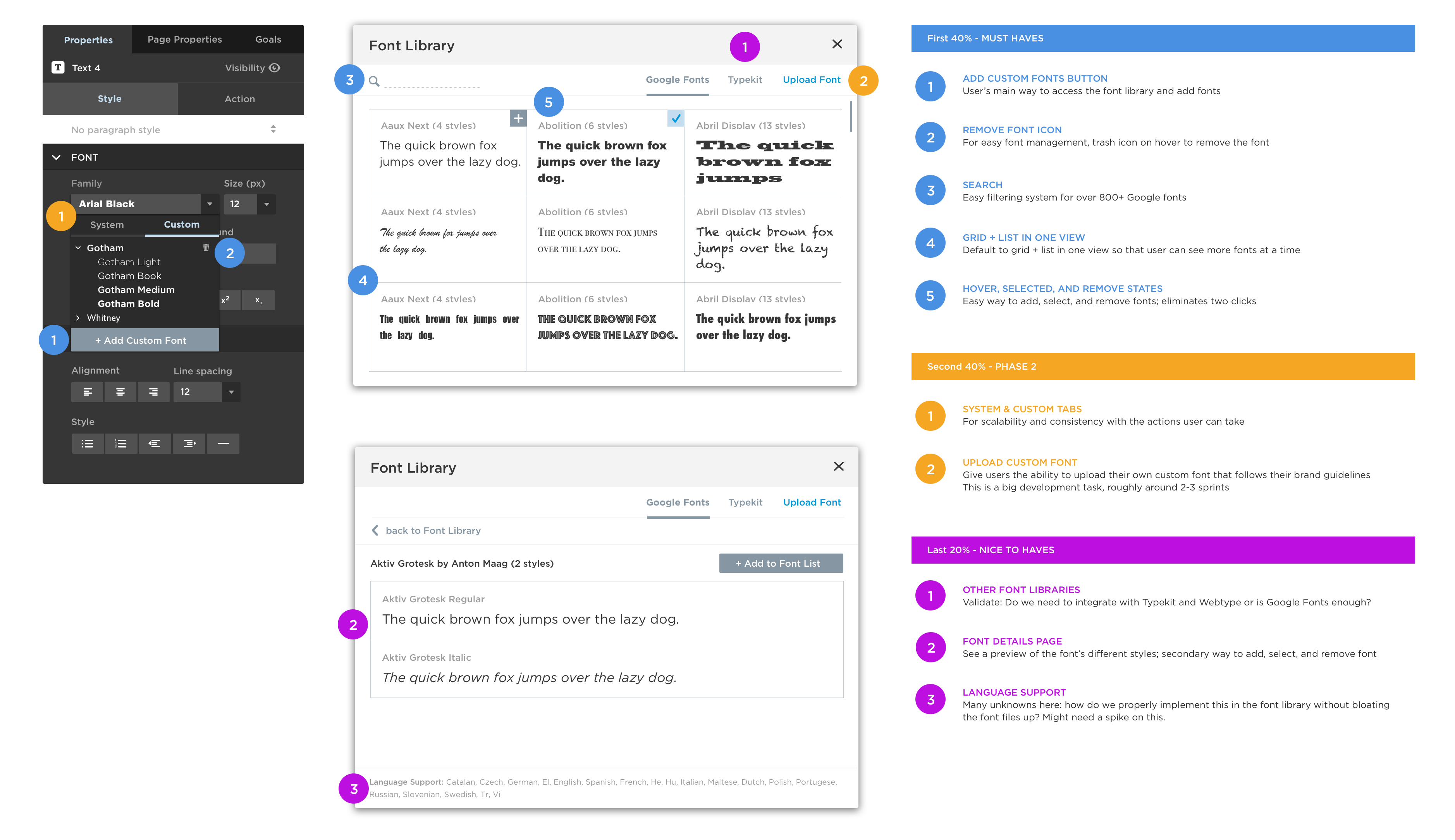
The 40/40/20 model allowed myself, the Product Manager, and the development team to get alignment on what MVP was. This also showed the developers what was coming up, without cluttering the JIRA backlog. As seen below, the MVP was true to scope because we planned what we were going to build early.
We prioritized giving users the ability to add web fonts onto their pages because there were over 2000+ support tickets and questions in the community on this functionality. Our customers need to be able to adhere to their brand guidelines. Although they could do it with external custom code, it took a lot of the user's time.
Along with the release of the font picker (800+ Google fonts), we added the ability to edit font size and line height in the ITE as well as 10 new templates that showcased different type pairings on beautiful landing pages.

MADE WITH LOVE
Want to work together? Message me on Linkedin!