Personal branding = not easy at all. It's difficult to quantify and express yourself in a single icon and a couple of words. Before I even started sketching anything, I asked myself: Who am I? What do I like doing? What do I want to do? What am I trying to say? With these questions in mind, I started writing down key words and phrases that best represented me and my process. This proved to be quite helpful as it gave me a sense of what I didn't want (if that makes any sense). Summing up who I was tickled my mind for weeks!

My initial sketches got me going but they weren't where I wanted them to be. Some of my initial logos felt weak and none of them were speaking to me. I knew then that I was going through a creative block and needed to explore some more. I decided to take the rest of the day off to clear my head. Luckily, our portfolio development instructor, Dougal Muir, tasked us to write phrases about ourselves the next day. Some controlling ideas, if you will.
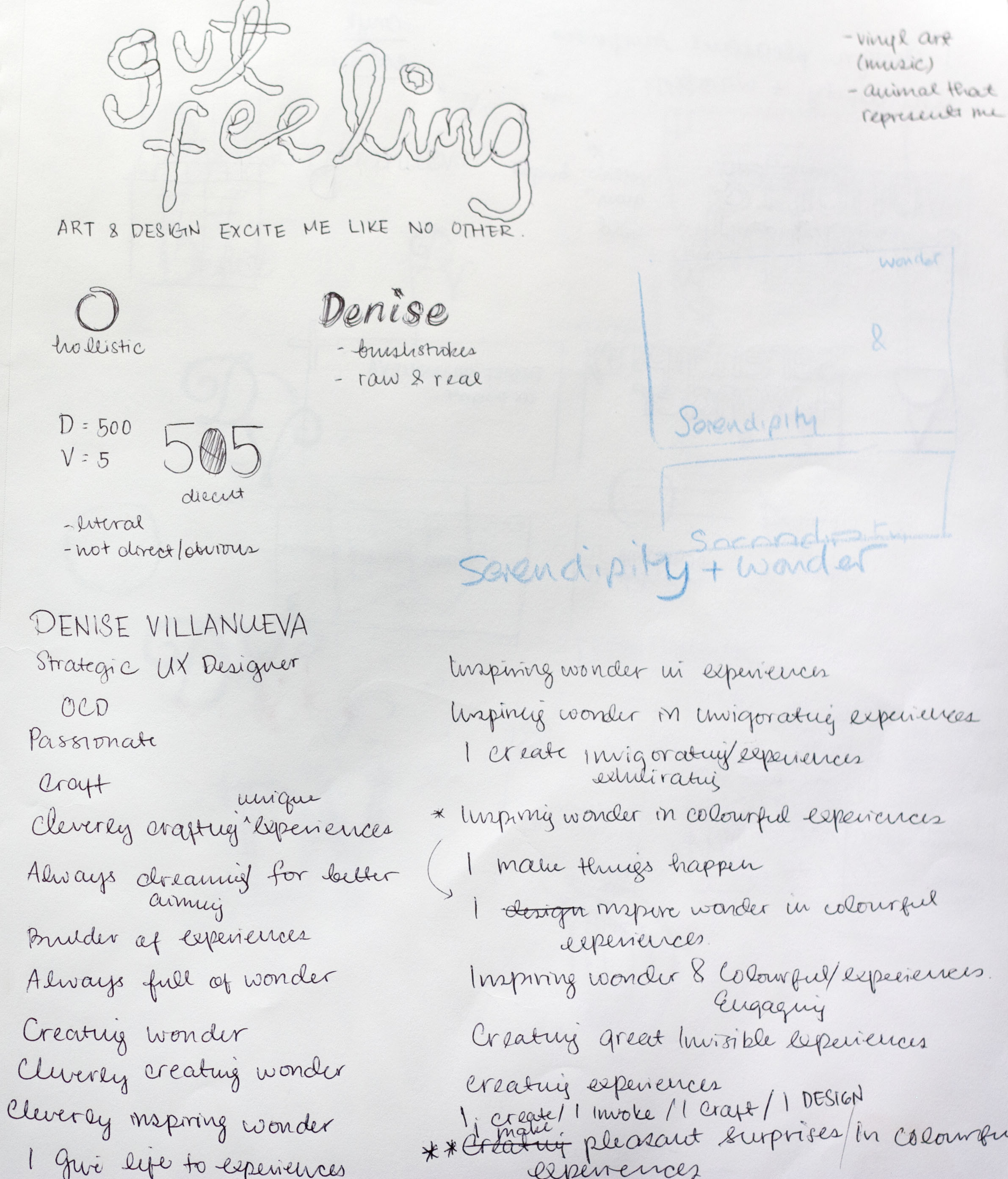
Two statements particularly stuck with me after the workshop:


There were a couple of concepts I was playing around with after Dougal helped me come to the phrase: serendipity and wonder. Because I'm in love with both UX and Branding, I thought of the blending of the two fields. Although they are different, the processes involved are similar in many ways. I saw this as an opportunity to tackle this idea full on with the metaphor of intersecting lines.


After many iterations, I still wasn't content. My gut was telling me to keep exploring. I couldn't imagine myself handing out these business cards to people. It's their first impression of who I am as a person as well as a designer. It had to be perfect. I went back to the drawing board and thought about what I was trying to say. I wanted to say that my design and strategy come together at the right time and I aim to make people wonder about how it all just fit like pieces of a puzzle--this led me to think of constellations!

Constellations appear only in the right moment, in the right area and people wondered about them constantly. Heck, that's what astronomy is for! The metaphor really hit me with joy, which is how I knew that it was exactly the kind of message that I wanted convey to people. The first iterations came from playing around with the stars. My colour palette changed slightly since I thought the dark blue was more relevant and fitting. Researching even further, I was able to recreate my zodiac sign (which happened to also be a constellation), Leo. Even though I thought it was an interesting illustration, I felt that it was too abstract. No one was going to know that it was a Leo.

I put my thinking back on! The number of iterations were piling up but I wasn't satisfied yet. I decided to simplify! Simplicity is equal to sophistication after all. I decided that one star would be enough. The challenge now was to tell the story of a serendipitous experience through a simpler medium. An epiphany hit me at this moment: Why not combine my original intersecting of fields with my constellation idea? This resulted in a simple icon that both represent intersections (my original idea) and constellations (serendipitous + wonder). My final business card looks like this! What do you think?
I had them printed at Jukebox Print in silk matte finish with UV spot on my logo icon and tagline at the back of the card.Turned out beautifully!
 Now comes the list of things I learned from doing my personal branding.
1. Trust your gut!
There are so many times that I deviate from what my gut says and I always end up regretting that decision. I knew that my initial concepts weren't good enough and I waited until the icon was just right. I think this comes with me being detail oriented, but sometimes you just really need to follow your instinct and keep trying.
2. Research, research, research!
The possibilities are limitless! I find that metaphors create the most interesting stories. In my case, I had a lot of fun connecting the dots (literally and figuratively).
3. Feedback is key
I find that asking for feedback helps me whether I'm going the right direction or not. Yes, you do need to trust your gut but fresh eyes to see your work could lead to new insights. I value getting feedback from trusted peers because they may see things you haven't seen because you've been working on your project for a long time.
4. Your type tells its own story.
Choosing the right type is key. I chose Gotham Bold for my name. It's strong, reliable, and feels very human. It symbolizes hope (shoutout to Obama), even though Thomas Frere-Jones didn't intend it to be this way. For my supporting text, I chose the Swiss classic, Helvetica for its clean and simple design.
5. Take your time.
You can't rush things, especially when it's a cumulation of who you are as a person and designer. If you're stuck, which I was for a little bit, take the time to do things you enjoy. I went and had a stroll at English Bay, read a book at Starbucks, drove around the city, etc. Do whatever you want to get inspired again!

No Comments.