Battlefy Player Experience
A complete look at the end-to-end player experience on the Battlefy platform.

Problem
As an esports tournament platform, Battlefy caters to two main user groups: Players and Organizers. For Players, all required critical information to successfully participate in a tournament lived on different pages:
- Player profile page
- Tournament page
- Match page
- Left sidebar
As a result, players spent time and energy trying to understand our platform instead of focusing on the tournament that they're playing in, their own performance, and the competitive experience. Players were missing critical information, which often led to disqualifications.
This also generated extra burden to organizers who have to deal with player support requests during the tournament when it should feel like the tournament is running on auto-pilot.
Over time, we’ve added tech and design debt since the majority of features were built in isolation due to tight deadlines and necessary compromises. This made it more difficult to build new features or optimize old ones. Ultimately, we couldn't create the best experience for our users.
Context
Tech and design debt: When I joined Battlefy, the platform was developed over 5 years ago using an older version of Angular. This made it extremely difficult to build features on top of the core product. Because of this, the team had been discussing the re-architecture of the platform on React. This migration of languages is still one of the major blockers Battlefy faces today.
High user churn: Battlefy had low player retention rates overall. We knew from data that a user's first tournament experience either brought them back for a second, third, and fourth tournament (good experience) or turned them away forever.
B2B client and revenue-focused: In the last few years, Battlefy's focus was to increase revenue, which meant activating more B2B client deals. This involved not only marketing landing pages but some custom feature requests as well. Due to the tight deadlines that came with client contracts, there was almost no design or technical documentation for previous work. This added debt in the product.
Battlefy's future hinges on its ability to create a marketplace that is self-sustaining and a profitable revenue model. With some of these B2B engagements driving hundreds of thousands of players to the platform, a strong association of Battlefy as a trusted and frictionless product is essential for a successful relationships with our users and clients.
Goals
Players must know their critical information and actions for upcoming tournaments. They should be able to access this easily. Players must also be informed of the actions' context. Due to the amount of confusion and frustration from players, we followed 'clarity > speed' principle throughout the design process. We would know if this is true if our missed check-ins decreases by 15%.
We know we have been successful if the number of player disqualifications due to inaction on critical information (check in) decreased.
Solution
A complete end-to-end player experience that included Global Player Guide (alerted users of critical actions they needed to take) and the Local Player Guide (from registration to reporting their game scores, the tournament experience was designed to be used in a singular place to remove any previous confusion).
Although we were only able to ship the Global Player Guide platform-wide and the Local Player Guide only on Hearthstone Masters and the National PUBG League's tournaments, the team has carried this solution and product strategy forward to the College League of Legends and Apex Legends Global Series league experiences. Both case studies coming soon.
Results
In the first month of the Global Player Guide's release, missed match check-ins decreased significantly from 42% to 29%. Additionally, tournament check-ins improved slightly. Since this feature relies on the browser notifications, we proved our hypothesis that the users who are still missing tournament check-ins are away from their computers and 15% of users have their ad blockers turned on which means that they are not receiving check-in notifications (via data, user interviews, and surveys).
Process
We had a major decision to make:
- Only solve design blockers, which would create more tech debt;
- Rebuild the current player guide in React but keep design;
- Or redo the entire design based on known issues and build it properly in React.
We believed #3 was the best option. With the amount of risks and unknowns (cost and scope) with this project, we decided to run a 3-day design spike. This business decision must be informed by our users so we aimed to answer these questions:
- What are our players' current end-to-end experience on our platform? Where are their biggest pain points? How are they working around those today?
- What are their motivations for competing?
- What critical actions are they missing? (Player behavioural and quantitative data)
- Is there a way to solve 80-90% of the problems, with only 20% of the cost? Versus solving 100% of the problems with 100% cost.
- What is the highest level cost (<1month, 1-2 months, 2 months+) of option C?
There is a chance that after the design spike, our conclusion would be that those are indeed our only options, and that option #3 will take 3+ months to design & build. However, we believe that the spike was a worthy endeavor to significantly de-risk our choice to do option #3. By understanding the entire problem set and their contexts, we will gain confidence in our decision to move forward with a redesign.
Design Spike
Design Spike
Design Spike
We gathered all the user problems from support tickets and platform data. Because this was a huge project, I led stakeholder interviews during this spike. From a business perspective, we wanted to align on what success looked like from the beginning to avoid any miscommunications later on. We identified our most critical blockers and biggest risks are in terms of player retention were in the Join and Play phases (highlighted below).
We gathered all the user problems from support tickets and platform data. Because this was a huge project, I led stakeholder interviews during this spike. From a business perspective, we wanted to align on what success looked like from the beginning to avoid any miscommunications later on. We identified our most critical blockers and biggest risks are in terms of player retention were in the Join and Play phases (highlighted below).
Along with the PM and a fellow designer, we gathered all the user problems from support tickets and platform data. Because this was a huge project, I led stakeholder interviews during this spike. From a business perspective, we wanted to align on what success looked like from the beginning to avoid any miscommunications later on. We identified our most critical blockers and biggest risks are in terms of player retention were in the Join and Play phases (highlighted below).

I also decided to participate in a tournament. This helped me empathize with players, identify frustrations, and communicate this visually with the team. We used this user journey to align on what our ideal experience should look like.


The design spike resulted in two high level user flows that I presented to stakeholders with each solution's pros and cons. Through feedback and iteration, the stakeholders and the team were aligned on the ideal experience which was a combination of the two.


Presenting flows kept the focus on the experience and information architecture, not the UI. To help the engineers start their technical design and lay the foundation work for the product, I added more detail to the user flow. Informed by the tech investigation, we decided to build the solution in React, the language in which we were migrating our new features to.
Presenting flows kept the focus on the experience and information architecture, not the UI. To help the engineers start their technical design and lay the foundation work for the product, I added more detail to the user flow. Informed by the tech investigation, we decided to build the solution in React, the language in which we were migrating our new features to.
Presenting flows kept the focus on the experience and information architecture, not the UI. To help the engineers start their technical design and lay the foundation work for the product, I added more detail to the user flow. Informed by the tech investigation, we decided to build the solution in React, the language in which we were migrating our new features to.
Presenting flows kept the focus on the experience and information architecture, not the UI. To help the engineers start their technical design and lay the foundation work for the product, I added more detail to the user flow. Informed by the tech investigation, we decided to build the solution in React, the language in which we were migrating our new features to.
Presenting flows kept the focus on the experience and information architecture, not the UI. To help the engineers start their technical design and lay the foundation work for the product, I added more detail to the user flow. Informed by the tech investigation, we decided to build the solution in React, the language in which we were migrating our new features to.


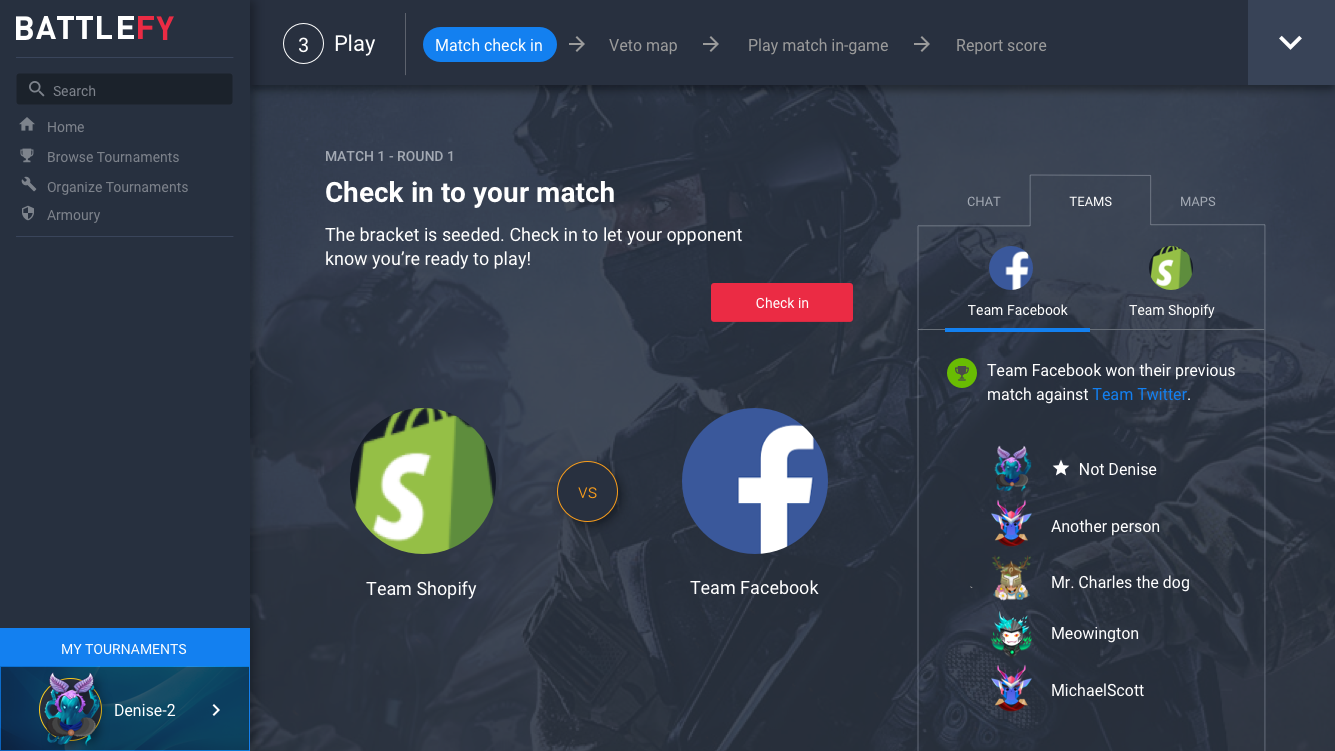
The Solution
All players will see a Dashboard when they log in - the content changes based on whether they've joined a tournament or not. All pages will have a Global Player Guide, which shows alerts for their tournaments' critical actions and links them directly to the tournament or match page to give our users peace of mind. On the tournament page, the player will see their Local Player Guide, which will house all critical actions, secondary actions/information, and the macro steps of the tournament.
I presented the final solution and got feedback to the engineers. In order to make sure there weren't any misunderstandings with the taxonomy we used internally, I wrote key definitions that served as our source of truth. Through sketching, I was able to iterate on the design and get feedback quickly.


Wireframes
I conducted usability studies on both players and internal users using low-fidelity Invision prototypes to de-risk the design. We discussed each iteration as a team and moved forward with testing wireframes v3 and v4 (see below). We received positive feedback, which made us confident to move forward with high-fidelity mockups. Some adjustments included drawing attention to these new features when users log in for the first time.


I used Principle to show the interaction design (see prototype below). These subtle animations made the solution feel like everything is moving forward in design.


To make sure that the design is scalable, I worked on the team-based games play experience as well. The main difference was the player's ability to create, edit, and invite a team to compete with. This posed many questions to existing tech debt on how the teams feature was built previously. Below are some of the mockups I presented to the team and stakeholders in order to show the adaptability of the design laws.


Execution Strategy
We chose to ship Global Player Guide first platform-wide -- the improved notification system that is easily accessible to users. It alerts the user as to when there's a critical action they need to act on. We believe that the Global Player Guide would answer a lot of our users' confusion on where to find their tournament and what their next action is. As a team, we went through all the notifications and removed any non-critical ones to increase the importance of the ones they do receive.


Notifications before and after.
Notifications before and after.
Anywhere on the platform, users will see their avatar turn from blue to red. This lets the user know that there's something very important they need to attend to. This colour change is something players are used to seeing in video games. Gamers' peripheral view and depth-of-field are much more developed due to paying attention to multiple things on the screen at the same time. We added "My tournaments" as we found that users were looking for their joined tournaments in the Global Player Guide during the usability studies. We also learned that this is where players expected to see their past tournaments. First time users will see an onboarding tooltip to let them know about this new feature.
Due to legacy tech and design debt, we needed to break consistency from desktop and mobile. Our user goals for this solution was to give users easy access to all critical information and actions they need to take so they do not get disqualified. On mobile, the left sidebar is hidden behind a hamburger menu. Instead of keeping the Global Player Guide in the hamburger menu, we moved it to the upper right corner -- in plain sight. Since we know that 50% of our Players use their mobile phones to participate in tournaments, we couln't afford the risk of hiding important tournament information.
Due to legacy tech and design debt, we needed to break consistency from desktop and mobile. Our user goals for this solution was to give users easy access to all critical information and actions they need to take so they do not get disqualified. On mobile, the left sidebar is hidden behind a hamburger menu. Instead of keeping the Global Player Guide in the hamburger menu, we moved it to the upper right corner -- in plain sight. Since we know that 50% of our Players use their mobile phones to participate in tournaments, we couln't afford the risk of hiding important tournament information.

Today, we have shipped the Player Dashboard and Lobal Player Guide in key game titles and developers such as the National PUBG League (Bluehole Corporation), Collegiate League of Legends (Riot Games), Apex Legends Global Series (EA, Respawn).

MADE WITH LOVE
Want to work together? Message me on Linkedin!