Problem
Having a great teammate is essential to winning matches in Battle Royale games such as Fortnite. Finding a teammate via in-game or other Looking For Group (LFG) apps is tedious and often fail to take personality, skill, and availability into account.
Solution
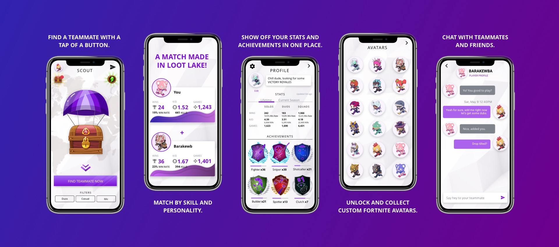
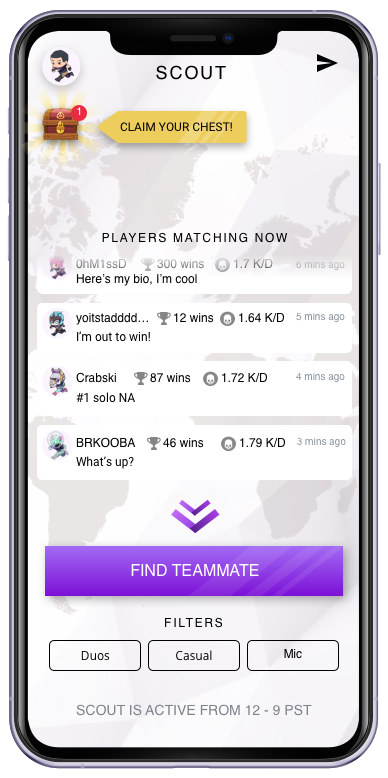
SCOUT is a mobile app that makes it insanely fun and easy to find and connect with great teammates. With a tap of a button, players could find a duo partner for Fortnite. The app allowed users to search for players in their platform, with mic (we found this to be very important) and between competitive/casual.
Results
150,000+ Apple and Android users
1M+ chat messages sent
30,000+ happy matches
Our most obsessed users matched 100x each
1000+ V-Bucks winners
60+% of users would be very disappointed if they could no longer use SCOUT (source)
Even though we originally built SCOUT to find a player's ideal teammate, we realized through research that users' find the most value out of SCOUT because of the friendships they've made. This was truly an AHA moment for me and the team. It gave us the confidence to experiment with more social features and truly understood who our users were.
My Role
UX Design, UI Design, Product Design and Strategy, Interaction Design, Mobile Design
- Led design for Beta version onwards.
CREDITS: Original team - Sam Bremang, Colton Arabsky, Eric Leong, Chris Lee, Tad Huang, Matthew Mayer, Harry Delamore, Dmytro Iefremov; V8 onwards - Jamie Camiling, Jordon Smith, Tom Lou, Bo Peng, Alex Saunders
Context
Experimentation in B2C
Battlefy's main source of revenue has historically been from B2B engagements. Often with tight deadlines, lack of pipeline visibility, and unvalidated client feature requests, the team's focus was delivering these on time. Securing funding in late 2017 enabled the team to experiment on B2C products, with the end goal of creating a self-sustaining revenue model.
Battlefy's mission was to power all of esports. That meant that in order to be successful in the esports industry, we needed to level up every player to that competitiveness. After all, esports is global because it's online. We wanted to reach a wider audience.
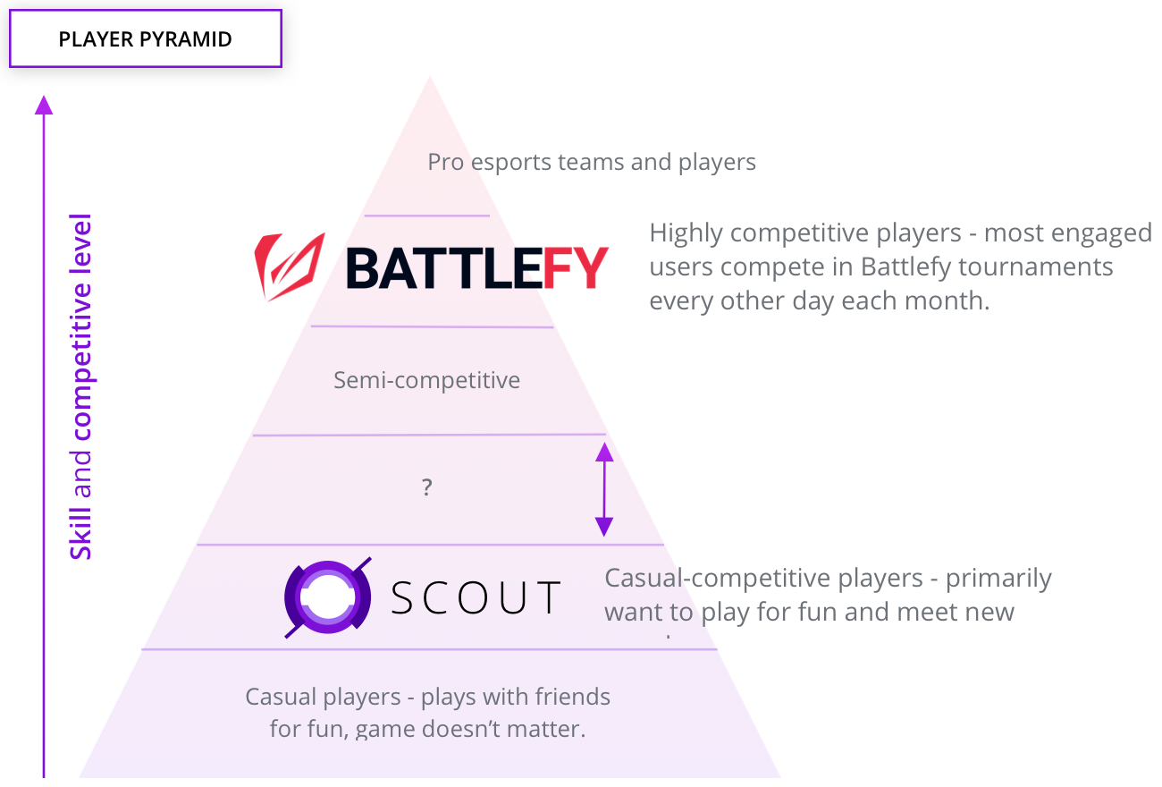
Battlefy's platform is primarly geared towards highly competitive players. These players are extremely engaged with their game; practising and competing to improve. From data, these users join a tournament on Battlefy every other day. This was a huge barrier to entry for more casual players. Just like in traditional sports, not everyone can become a pro athlete.
The vision was to build products for the entire player pyramid; each delivering value to the users in the different stages of competitiveness.
Separating brands
SCOUT operated like a startup within Battlefy. It was important that we found product market fit, retain users, scale, and make revenue on our own two feet. This allowed us to move without any preconceived biases about Battlefy's platform and brand.
If the product was successful, we would connect the two brands under one umbrella. These products would be serving the greater goal of empowering players across the entire pyramid.
Process
Market research
We chose Fortnite, the most popular Battle Royale game at that time because the total available market (TAM) was huge. Its monthly active users surpassed any other game in history within its first year. Initital research showed that Looking For Group (LFG) was a user need, this was our serviceable available market (SAM). We chose this problem to solve because we believed that the next step in the player pyramid is finding teammates to compete with seriously. The team found that highly competitive players requested for platform, mic, in-game skills (Kill/Death ratio and win rate), and personality.
Alternatives either asked the user to input a multitude of their preferences before showing them any value (heavy cognitive load) and once complete, the user's match request is posted in a discussion board, which had huge emotional baggage on a social level. Unanswered posts felt desperate. Majority of users said that current alternatives are either too complex or took too long. Some of them were too exclusive.
My contribution at this stage of the process was giving feedback every two weeks during what we call Blue Team meetings. This concept is taken from Ed Catmull (Pixar)'s Creativity Inc. -- the execution team invited different stakeholders in the company who would be able to give direct, candid, and valuable feedback. It was a validation technique that involved different perspectives.
Vision and Objectives
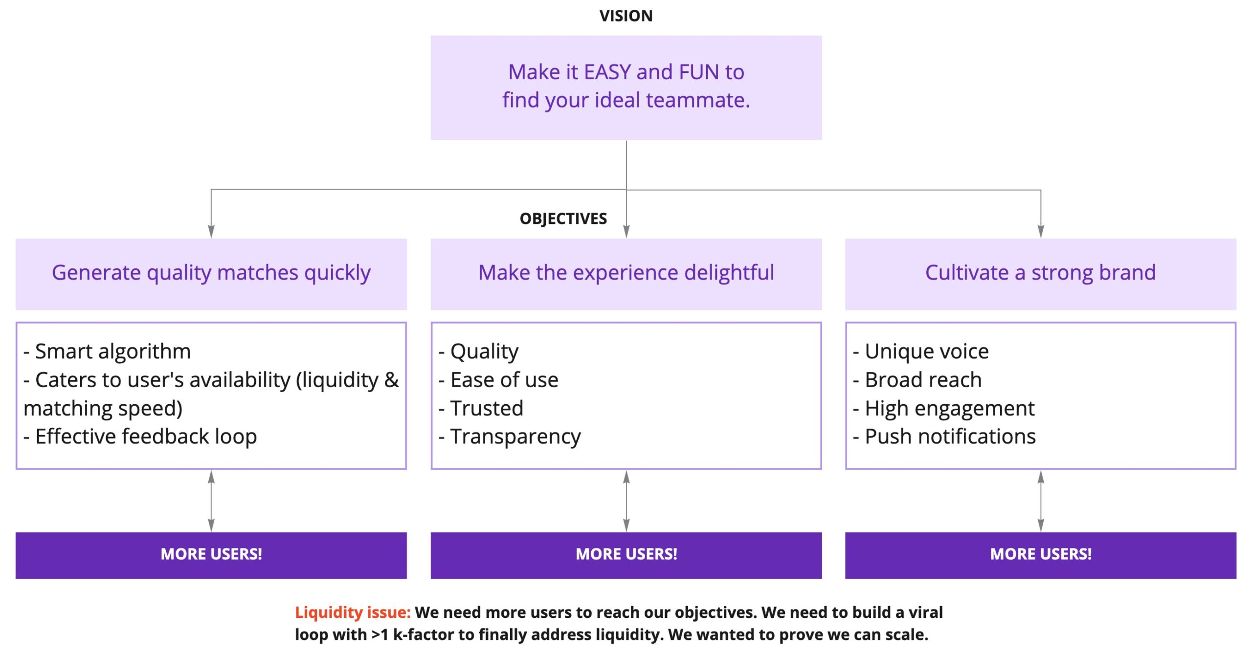
We created, updated, and refined the SCOUT vision throughout the year and a half. Ultimately, we wanted to make it easy and fun to find great teammates to play with. As we got to know our users deeply, we realized that the app was more than just for finding teammates. It was an app our most dedicated and engaged players used to find new friends, keep up with friends met on SCOUT, and have fun.
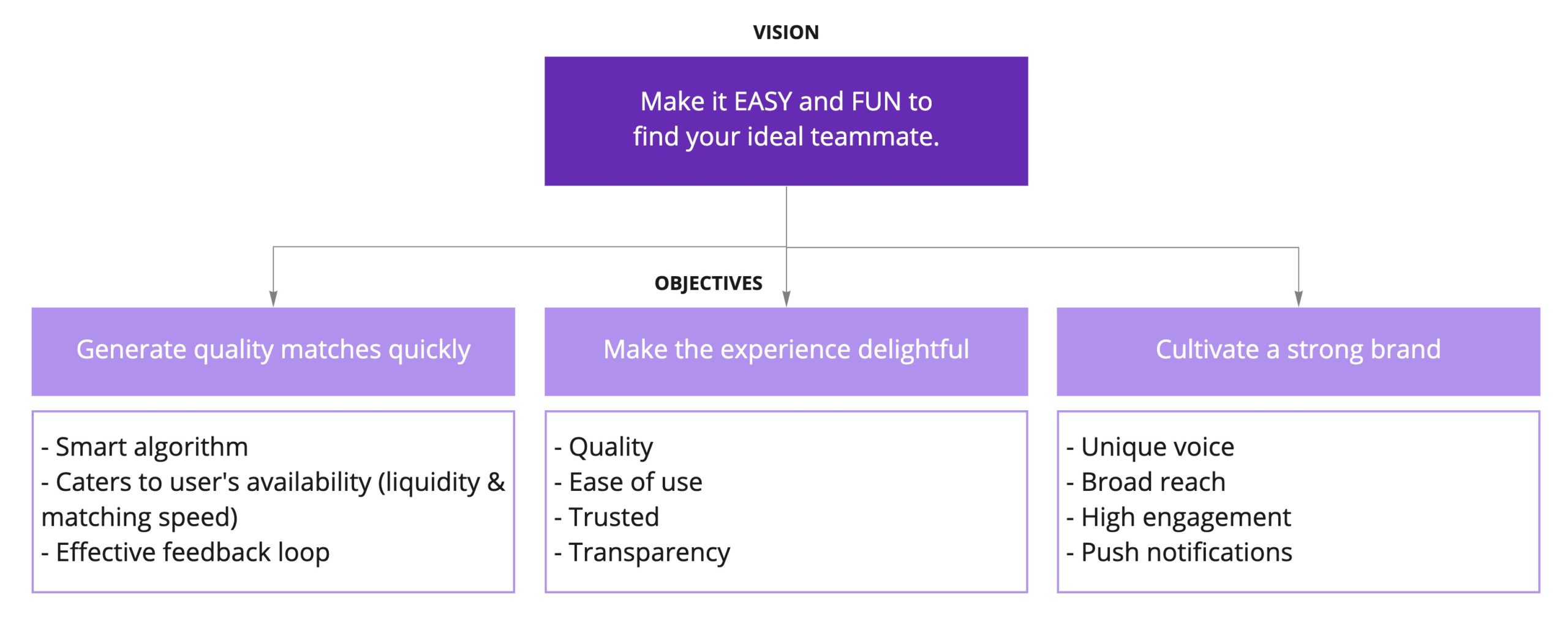
Our objectives stayed the same over time. To achieve our vision, we needed to generate quality matches quickly, make the experience delightful, and cultivate a strong brand that could stand on its own.
Determining MVP
We wanted to prove that we can create an LFG experience that felt like magic. We didn't want any cognitive, social, and emotinoal load on the user. Our first test was simple: Tap a button → Find a teammate.
ORIGINAL HYPOTHESIS
Ideal teammate = skill + personality fit
We broke down what those key attributes meant:
- Ideal: High quality, quick, accurate
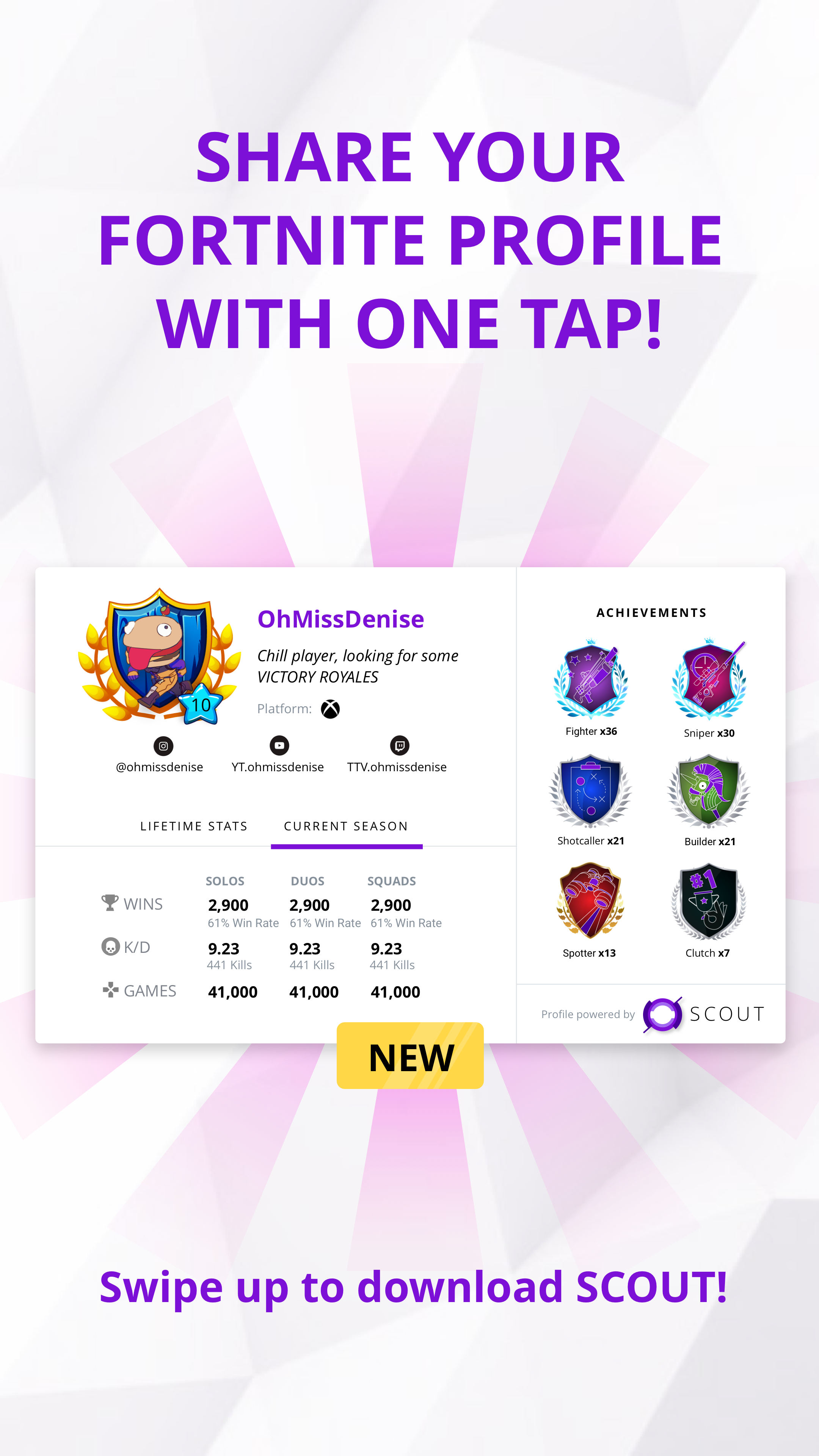
- Skill: KD ratio, win rate, kills, games played, and SCOUT tags (#builder, #sniper, etc.)
- Personality: Teamplayer, communicator, not toxic, and SCOUT traits (#toxic, #chill, etc.)
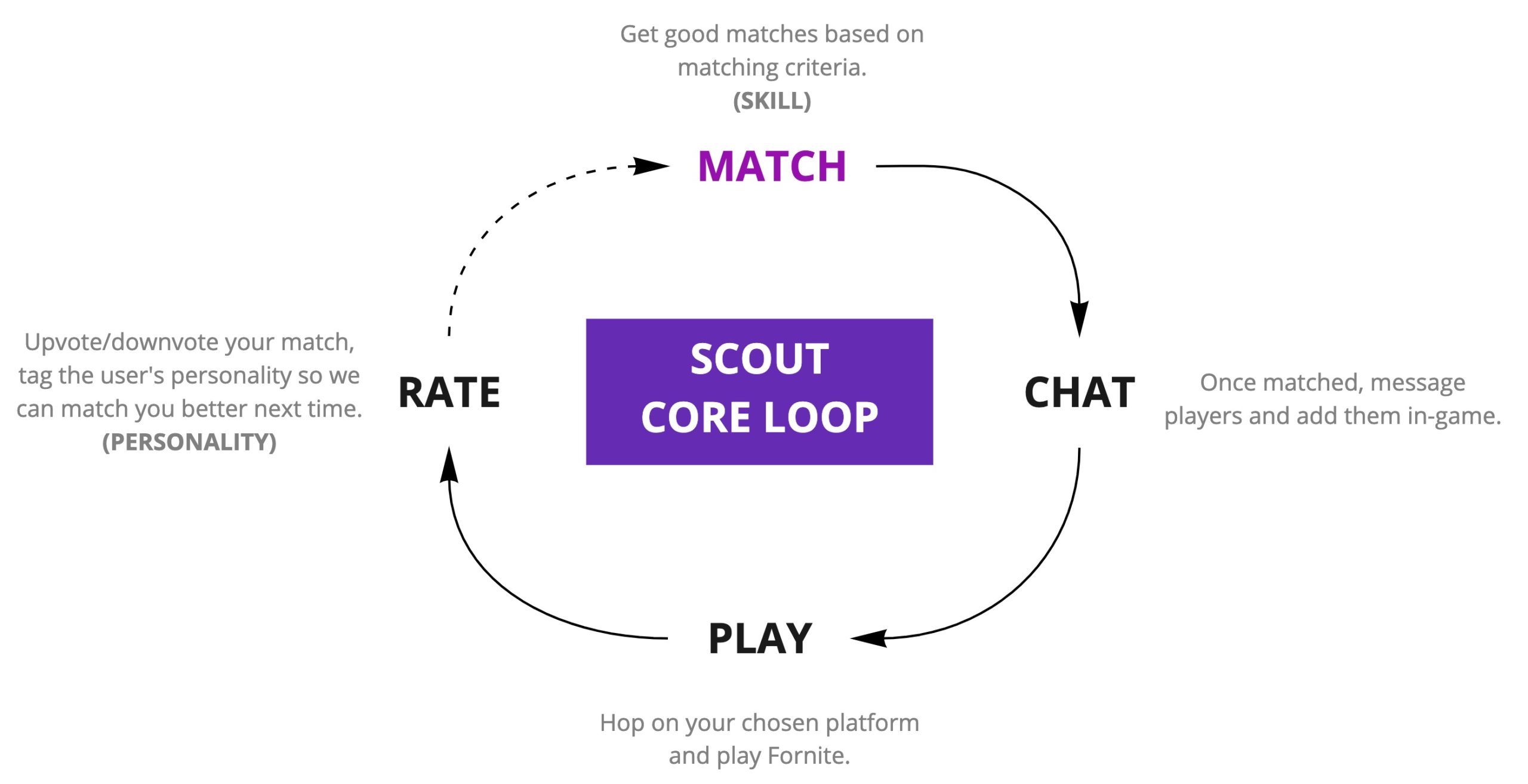
SCOUT core loop - Follows the HOOKED model by Nir Eyal.
SCOUT core loop - Follows the HOOKED model by Nir Eyal.
To make the experience feel frictionless, we wanted to build a smart AI back-end that matched users perfectly to their preferences. The matching algorithm would be AI-driven; a machine learning recommendation algorithm that learned the skill & personality attributes of your ideal teammate. In addition, users would be able to upvote or downvote as a response variable.
It was challenging to build a recommendation engine in the beginning because 1. we didn't have any quantitative data for SCOUT since it was a brand new product, and 2. we wanted to get a beta out for players to use it to get as much feedback as possible.
In order to provide matches quickly, we needed a high volume of users in the platform and in-queue at any given time to match with. We also needed to ensure quality, this would be handled by peer feedback, reviews, and self-assessment.
The original team quickly created a prototype to test the idea. Users were invited to the office to go through the core experience. These test sessions validated that users didn't necessarily care about finding their 'ideal teammate' using this special algorithm, they just wanted to play now. It was confirmation that we didn't need the complexity. We would launch without the algorithm and match players at random, observe how the ratings were, and work on it for v2.
Beta launch
Following the lean startup approach, we wanted to test our riskiest assumptions first. For us, that was that we could actually match users with ideal partners.

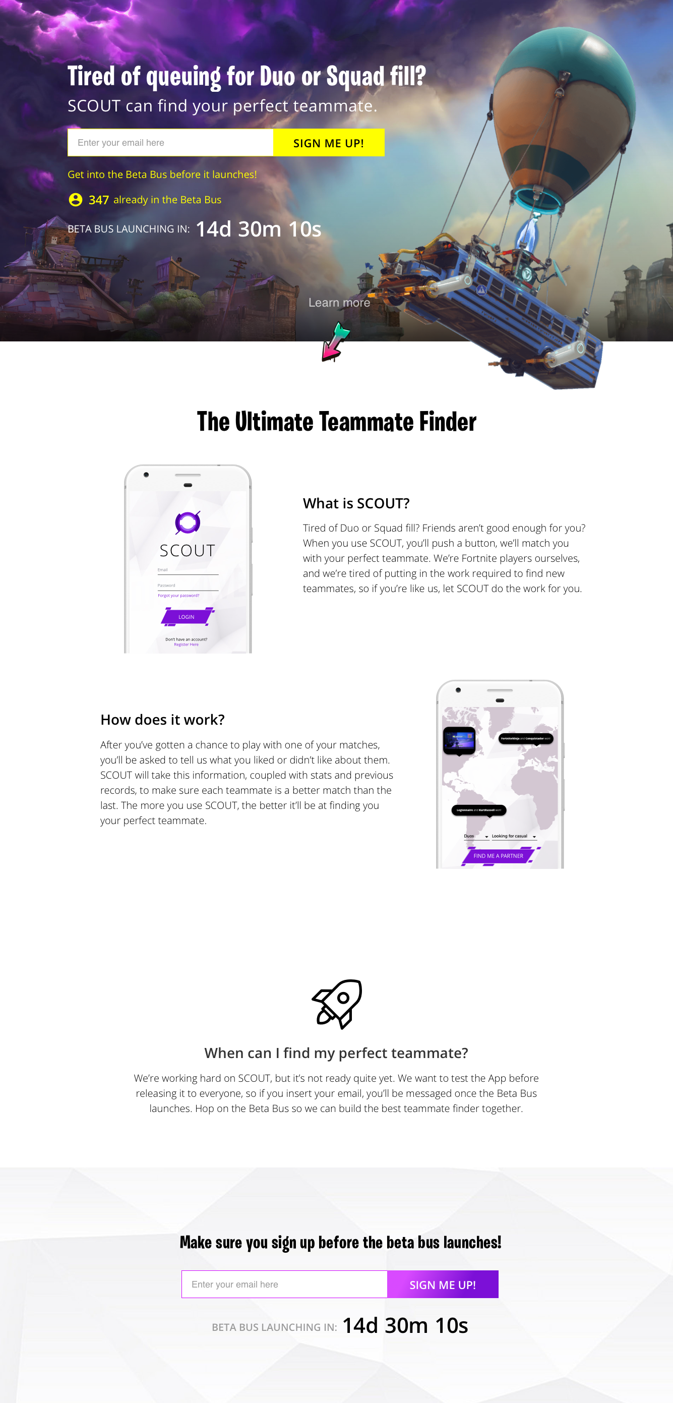
USER ACQUISITION
To create awareness of the brand and BETA program, we decided to distribute our user acquisition in multiple ways:
- Landing page
- Paid advertising through Instagram + Facebook
- Paid Instagram influencer posts
- Facebook Group admin reachouts
- Email outreach
- Reddit posts and threads
Since this was a completely new product, we wanted to gauge the market's interest by creating a SCOUT landing page. Users would learn about what SCOUT is, sign up for the BETA program and get early access to download the app by leaving their email. We received 4,000 emails for this campaign.
Equipped with real user feedback, the team started building the SCOUT MVP. I was officially brought in to lead the design moving forward. Beta v1 would only match users based on their platform and mic preferences. Competitive/casual would not be binding, since we wanted to maximize the number of matches and lower the wait time for users in-queue. To ensure more users matching, the queue window was only from 3-6PM PST. When we had more liquidity in the platform in later versions of the app, we opened the queue window to be 24 hours.

Beta mockups by Chris Lee.
BETA PRODUCT GOALS:
- After 10 matches (~1 week), we can match users with ideal partners > 50% of the time.
- Engagement: core loop should delight users enough that they match and rate multiple times a day.
- By users rating their matches, we can increase the number of times users match with ideal partners by learning the skills and personalities that work well together.
- Collect as much behavioural data as possible.
- Early retention: experience should delight users enough that they come back to the app multiple times a week.
- We set our goals based on industry standards: D1 (+40%) → D3 (+20%) → D7 (+10%)
- Late retention: the more users match, the more accurate we would be able to match them, which means they will come back to the app multiple times every month.
- We set our goals based on industry standards: D7 (+20%) → D14 (+15%) → D30 (+10%)
- Early retention: experience should delight users enough that they come back to the app multiple times a week.
Wet met our marketing and product goals. In our first week, our DAUs were 250+, with each user matching 2+ per day. We had a 61% upvote rate (our goal was 50%). For high-skilled players (100+ solo wins), the upvote rate was 40% (Later we realized this was because our userbase was very casual). We also hit our early retention goals at D1 = 45%, D3 = 20%, D7 = 12%.
With these great results, our next steps were to improve the matching algorithm, tagging, and rating flows.
Improved Matches, Tagging, and Rating
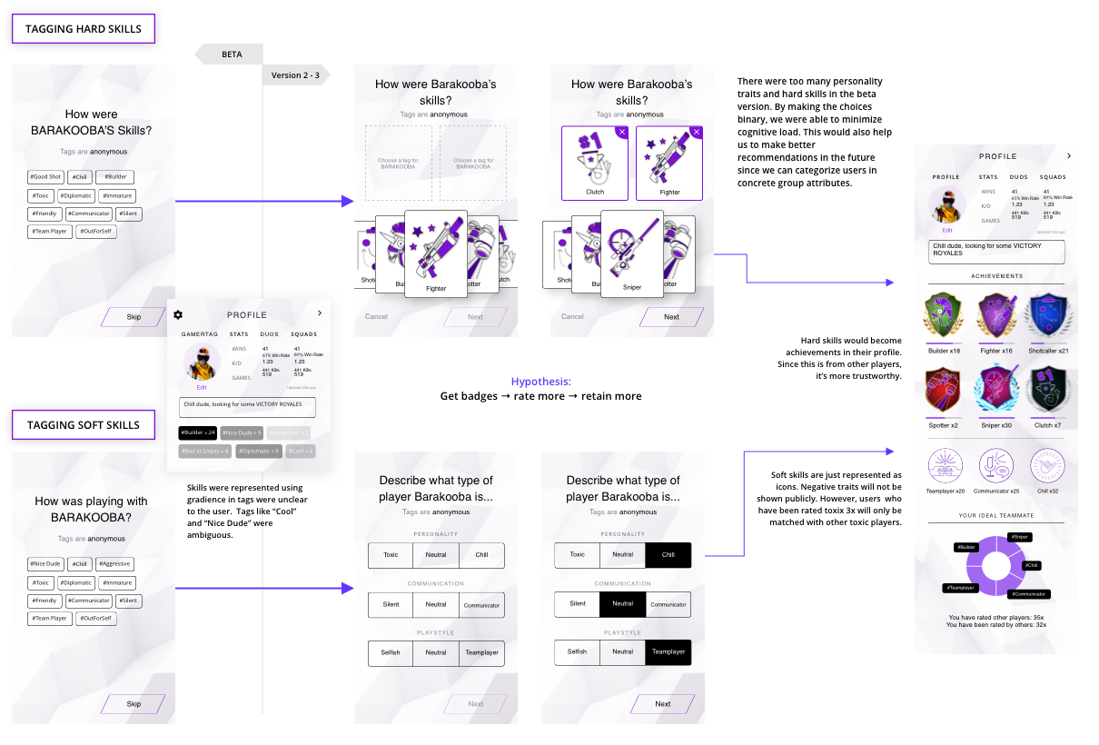
Originally, users were given 10 hard skills and 10 soft skills to tag their matches. The data was very polluted. There were too many variables and users were skipping this step. From the data we've collected so far, users who tagged and rated a match returned to the app again. In addition, users who upvoted a good match also had higher retention rates.
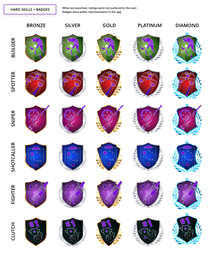
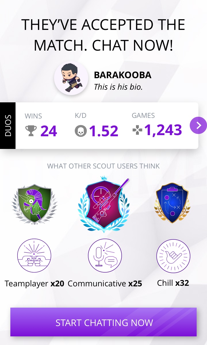
The data scientist and I worked on a solution to improve the information we collected. We grouped the original tags and looked at how many users used each. I designed the new tagging steps to be a binary choice. Users should feel confident in rating their partners. The hypothesis was that if we made tagging and rating easy and fun, users would do this more often, which would help us match them to great teammates better.
I decided to conduct user interviews and received positive feedback on the profile and badges. Although users enjoyed looking at their match's profile before chatting with them to see their stats, this ultimately did not the goal. We wanted users to rate their matches more often. Rating was the ‘investment’ step in our Hooked Model. The more you completed the full core loop, the more likely you were to execute the next action (pressing match request). If we increased rating frequency, then retention would increase.
During interviews, users told us that they didn't necessarily played with their matches right away or that because they didn't like their match's stats, they didn't play with them at all. This barrier to actually playing together was something we could not control.
UPDATED HYPOTHESIS
Ideal teammate = skill + personality fit + availability
Along with the new tagging experience, we worked on getting users to upvote their matches more often. Upvotes were a measurement of finding a user's ideal teammate. Upvote percentage was correlated with retention. We saw users who found their ideal teammates used the app more often. Our smart algorithm started by matching users by random. Now backed with some data, we started matching users based on 3 KD buckets. This meant users who matched had similar in-game stats. We also aimed to shorten the queue time. Data showed the majority of users cancelled their queue in 2 minutes. The algorithm would automatically open matching preferences at 3 distinct time periods in queue. At the 2-minute mark (red zone), we matched users at random. Because we wanted to maximize the amount of matches, we sacrificed the quality.
With this release, users upvoted their matches more often. We met the overall upvote percentage goal of 50%, as well as per queue zone -- green 60%, orange 50%, and red 40%. The zone experiment also decreased the number of users cancelling their wait.
Continue, pivot, or sunset?
Since we were an experimental team, we were always trying to prove that SCOUT can become a massively scalable, high-retention platform that would eventually make revenue. We needed to pause and evaluate whether we should continue building the app, based on the data we had. We had a choice to make: Full launch, continue to v5, or pivot.
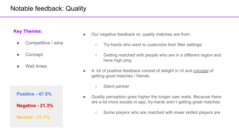
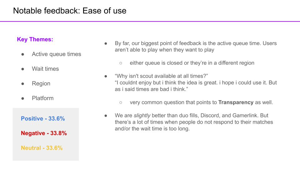
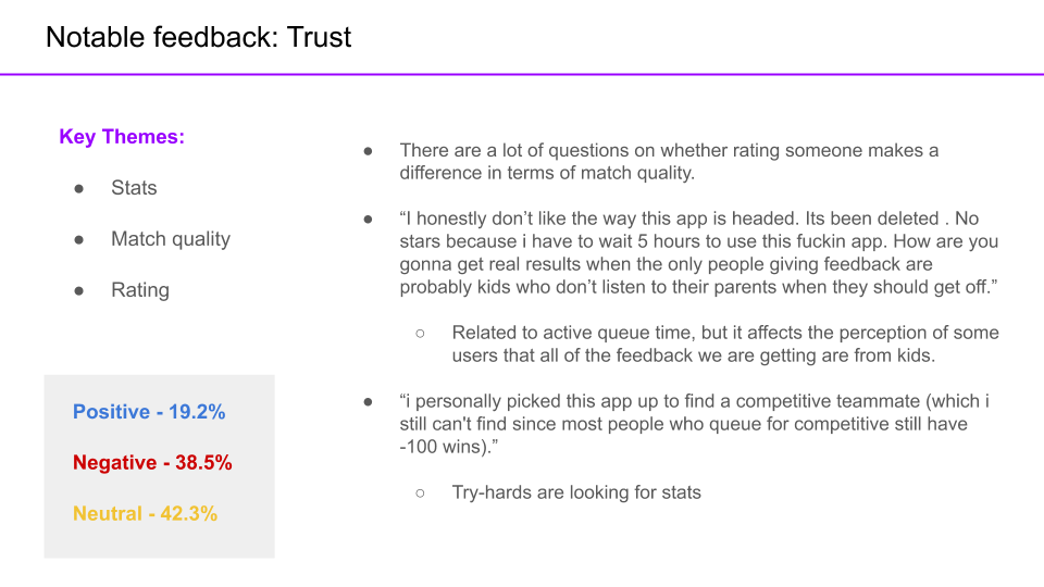
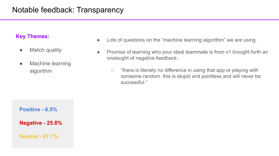
This was a turning point for SCOUT. We needed to take the time to get this right. When we started this project, we wanted to move fast and break things. It was about starting with a game with a huge playerbase and getting as much data as possible. It was time to focus on the quality of our features. To inform our decision as a team, I conducted a feedback audit, power user analysis, and deep user interviews. I worked with the PM to collect quantitative and behavioural data in order to get the full picture. Togther, we presented the findings to the team to create. At the end of 3 presentations, we decided to continue SCOUT as a team.
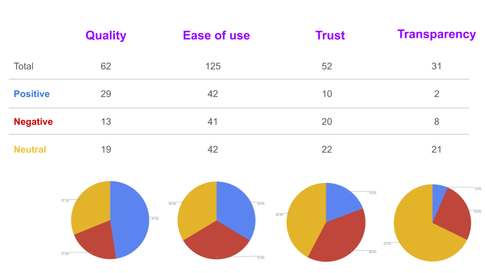
FEEDBACK AUDIT
The measurement was the qualitative feedback we received against on our original values.
USER INTERVIEWS
To understand our users, what their motivations were, and what content they shared, I conducted deep user interviews. I presented these findings to the team so that we can brainstorm on growth ideas with intent and understanding.
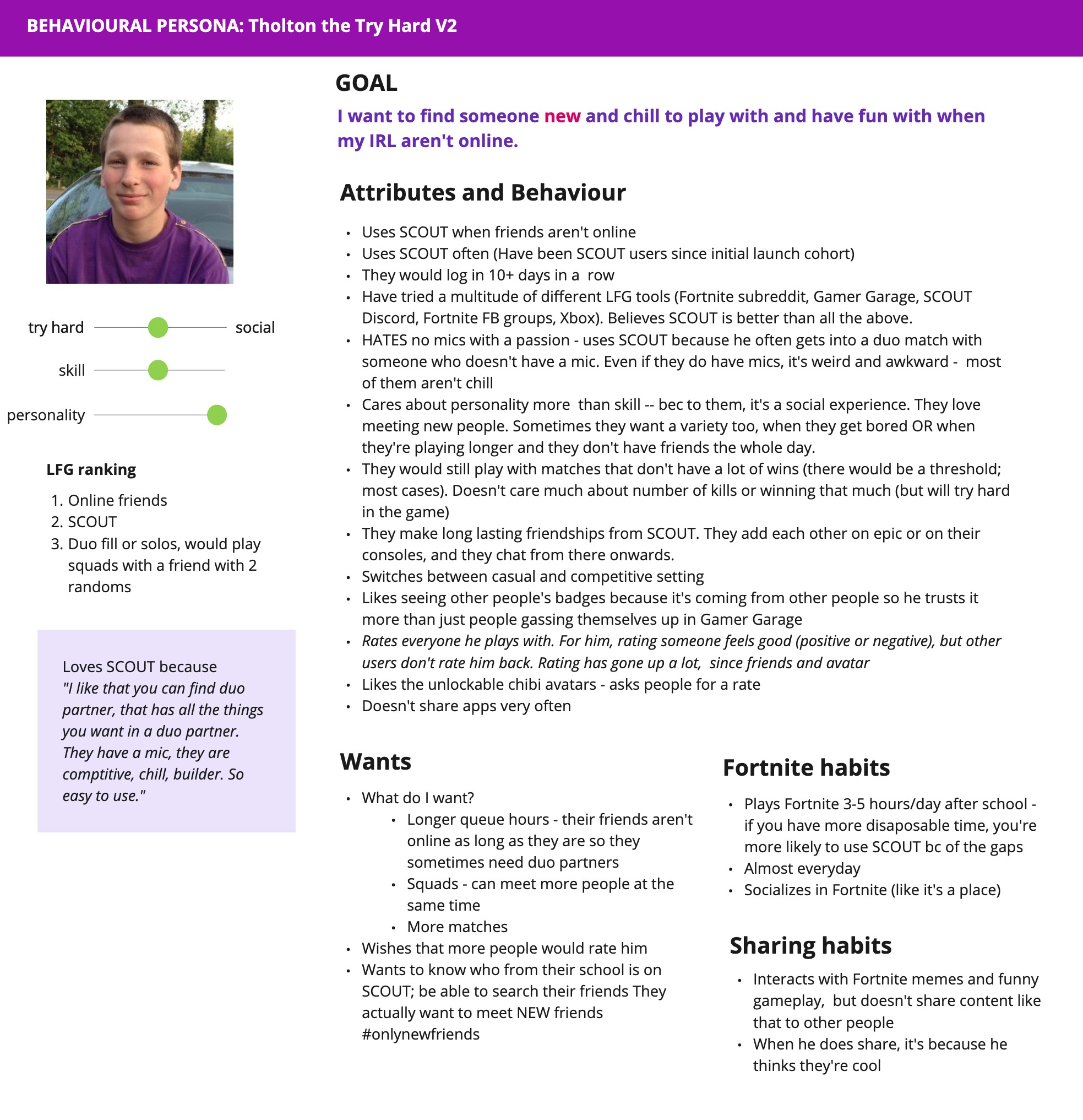
"Tholton the try hard" was our main behavioural persona. They were our most engaged user, logging in everyday and matching multiple times a day. They cared about winning and their teammate's personality equally. We found that our users' AHA moment was not playing Fortnite, but meeting new friends. SCOUT was their go-to app when their friends were not online. They were more casual than we originally expected and were motivated by loneliness and boredom to use the app. When using SCOUT, they felt belonging in a community. Moving forward, this would be our guiding document. I made design decisions based on whether it provided value and meaning to Tholton.
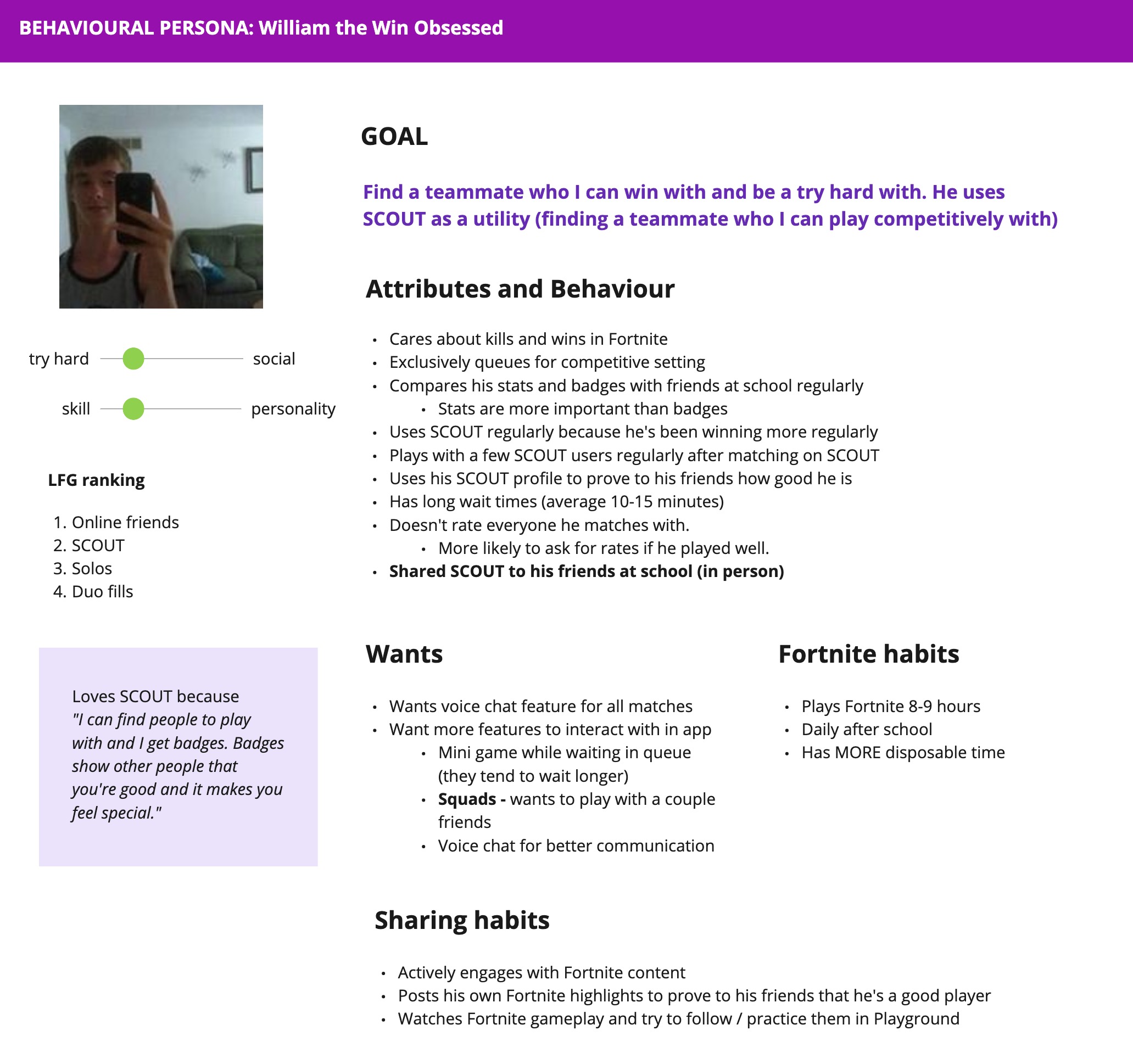
We were not satisfying "William the win obsessed", the very competitive users because we didn't have enough high-skilled players on the platform. Because of that, I couldn't justify building features that were related to competitive intelligence (ie. more detailed stats and in-game analysis).
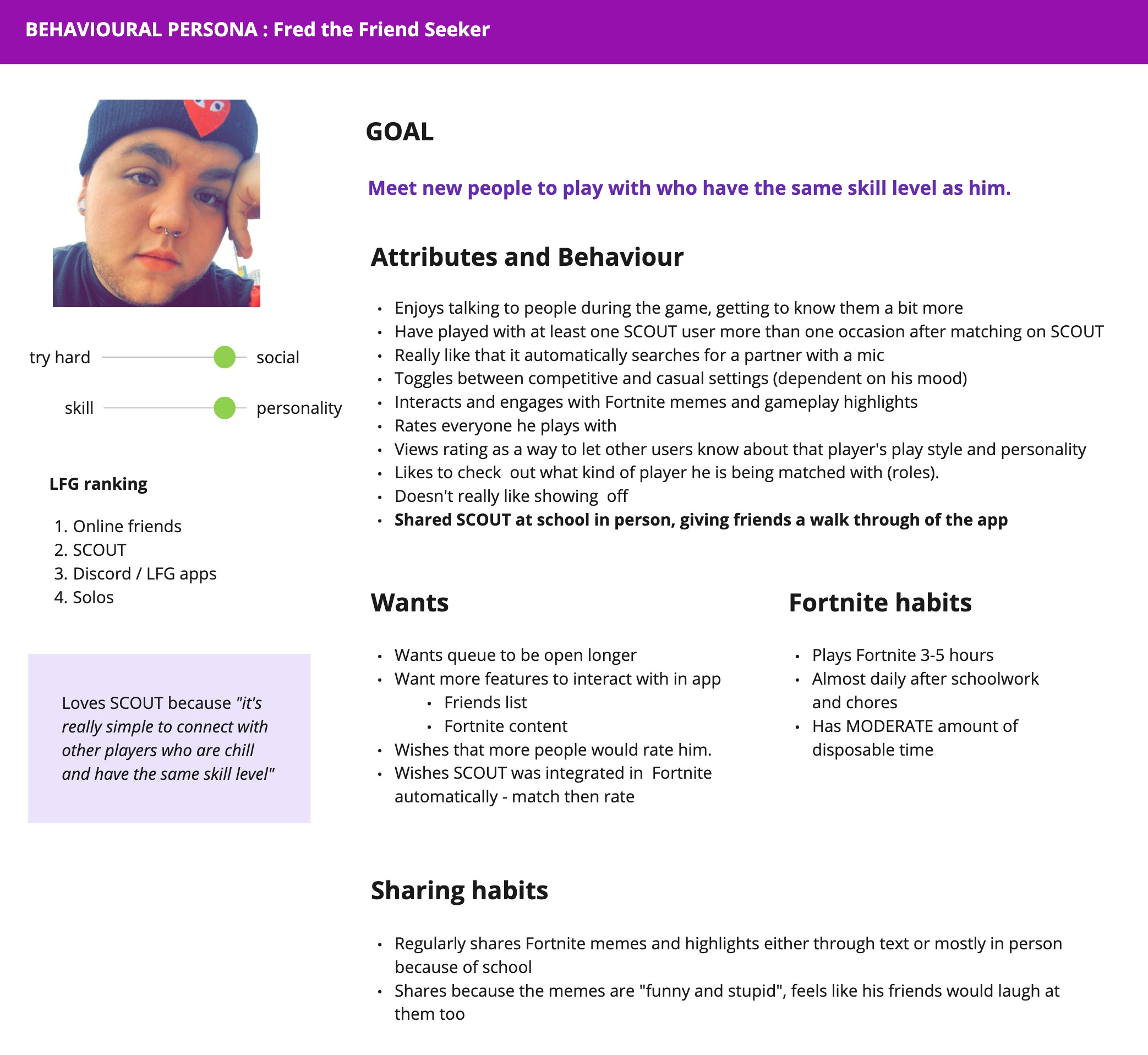
We decided not to focus on "Fred the friend seeker", those driven solely by the social aspect of the app. Even though they were quite active, SCOUT was not defensible to them. There were too many social apps that provided more value to this cohort of users.
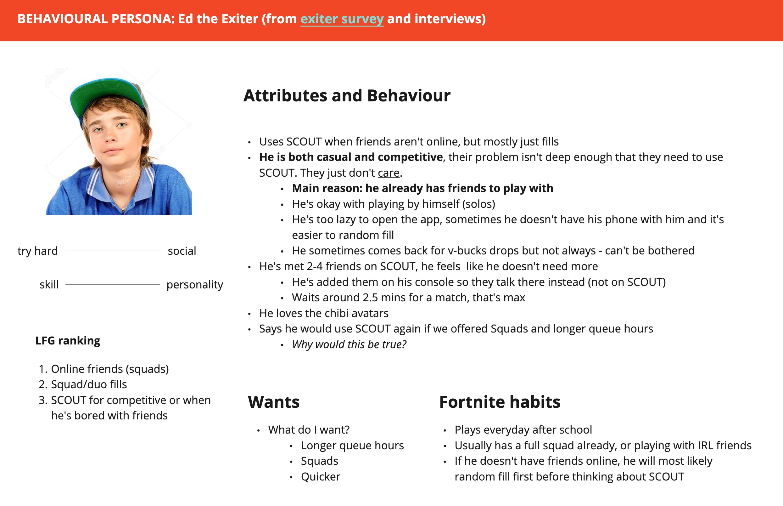
I also had the opportunity to reach out to users who did not like SCOUT or have churned since trying it once. These were not our target audience. As much as we understood who our users were, we also needed to know who they were not. "Ed the exiter" did not care about finding new teammates because they already had a lot of friends who played Fortnite in real life and preferred to play with people they knew.
I updated these personas as we learned more about our users. Even though I used the term 'persona', these artifacts are ultimately behavioural and completely based on motivations, rather than demographic information.
Growth and viral loops
The whole beta program aimed to prove retention and engagement, which we were able to do. The next step was driving more users into the app. It was time to soft launch in the app store, integrate our UA amd product efforts to iterate on a viral loop. Liquidity was the driver of the core product experience, which necessitated a well functioning viral loop. As a team, we had wanted to prove value first. The solutions weren't to make the product incrementally better, but to drive user growth. Once we saw that we could scale and retain users at growth, we would move on to monetization experiments.
The current product could sustainably retain an influx of users. User retention for those who matched (D1 = 50%, D3 = 22%, D7 = 12%, D14 = 7%) and rated (D1 = 60%, D3 = 29%, D7 = 17%. D14 = 9%) were phenomenal.
V-BUCKS DROPS
Our UA lead had a lot of experience growing mobile apps. There was a growing hype culture in our target audience's age group. There was a buzz about drops -- it felt special, these items were earnt, not bought. Companies like Nike, H&M, and Beats by Dre were giving away one-of-a-kind items for users who showed up at a specific time or place. The first-come-first-serve rule was a source of excitement, since only a very limited number of people would get it. We decided to test this for ourselves.
We experimented with V-Bucks Drops. V-Bucks were the in-game currency in Fortnite, that users can then use to buy skins, items, or save up for the seasonal Battle Pass. We varied the time of day to keep it fresh and make the experience exciting. We utilized push notifications to drive engagement.
Our hypothesis was that when we run V-Bucks giveaways, we expect DAUs to spike. We believed this was true because we saw from user research, social media interactions, and market studies that users love V-Bucks and bought into hype. We would know this is true if we could get at least 500 users to participate in our giveaways. The test was simple:
- Drop chests on the home screen throughout the day for N winners.
- Design the experience to be overlaid on the home screen to ease the conversion to "Find teammate".
- Ask users to share their unique referral code to get free chests.
- Allow new invited users to input referral codes upon sign up to collect free chests from the home screen.
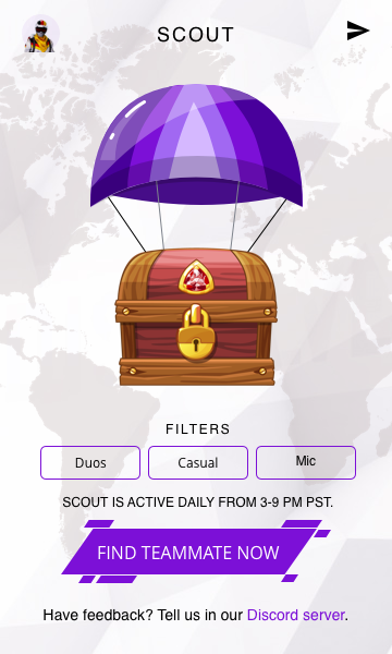
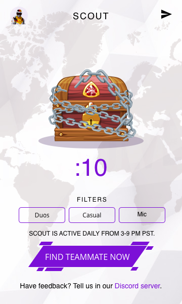
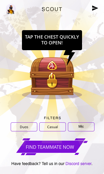
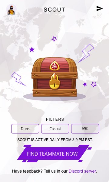
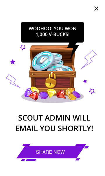
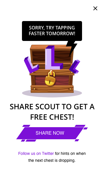
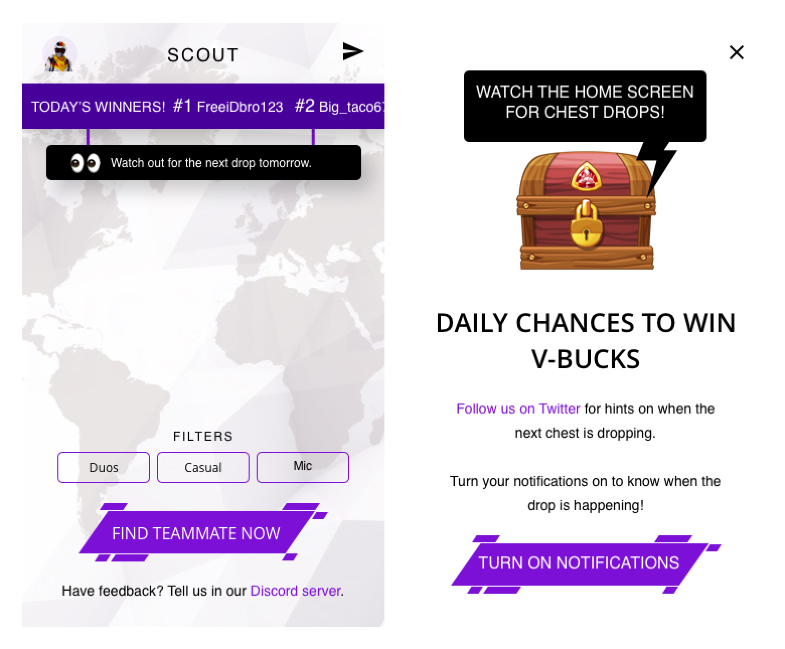
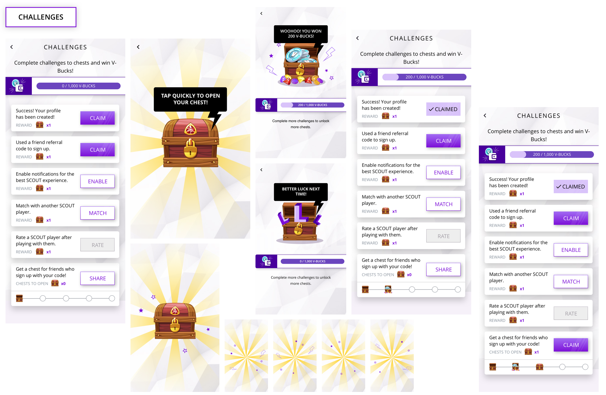
To create hype, I added a ticking banner on the home screen. Tapping on it showed how they could participate in the next drop. I worked with the developer to make sure the animations were smooth and reflected the excitement I wanted users to feel. Tapping on the chest sent sparks flying, then when it opened, there was a loading animation to create anticipation. We eventually experimented with the amounts of V-Bucks we gave away and how we did it. Our main goal was to increase DAUs. The V-Bucks drops spiked our DAUs to ~1,500.
We also wanted to convert a portion of V-Bucks participants to active users. V-Bucks was the hook and our core experience of finding teammates was what made people stay. We set out to convert 20% of new users. We ultimately landed on 25-40% conversion rate (~32% average = V-Bucks participation → match request), which was higher than even our stretch expectations.
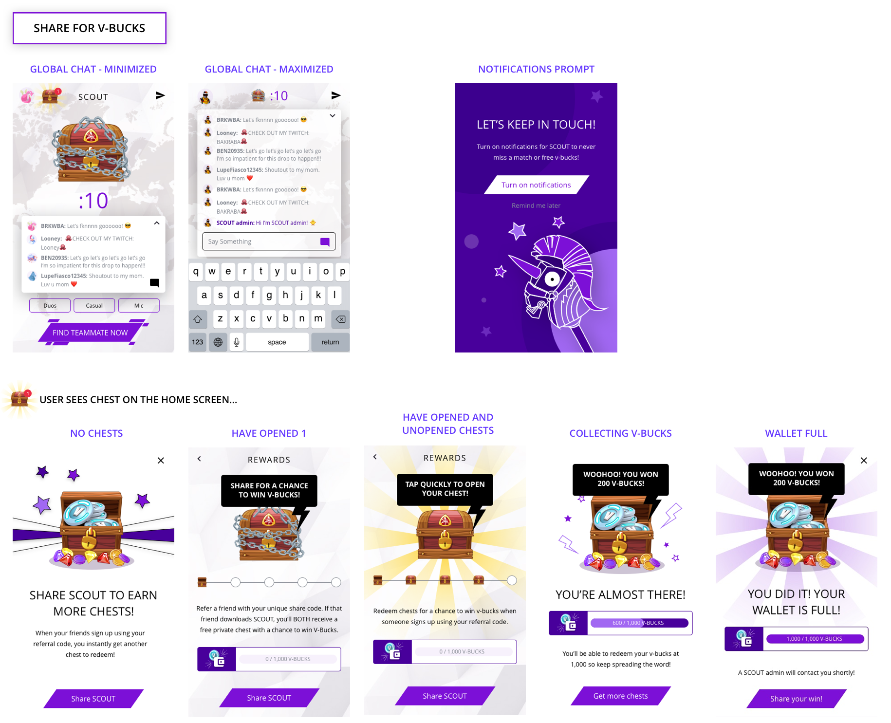
In addition, users were asked to share the app with a friend to both receive a chest. This meant both the inviter and invitee would get a chance to win V-Bucks. We would know this was true if users shared the app after a drop. The result was users were sharing at amuch higher rate than we thought. We allowed a maximum of 5 shares so that users could not take advantage of this.
This scale completely blew away our D7 (15-20%) and D14 (10-15%) retention goals. This was across ALL of our users, which meant that scale = liquidity = retention.
Out of 3,360 created account, 1,310 shared SCOUT (39% conversion) which drove 629 downloads. For K-Factor >1, we would need a 50% share conversion and 2 installs per sharer. We were not able to reach that percentage before we sunsetted the app.
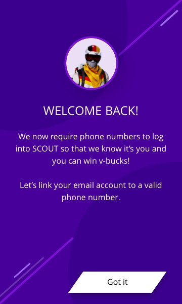
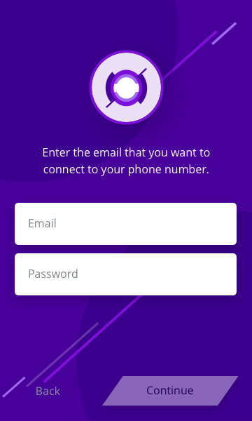
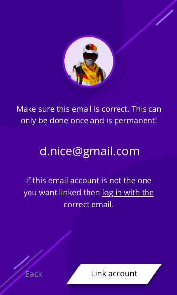
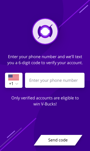
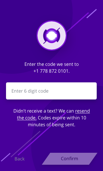
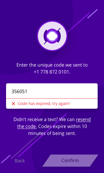
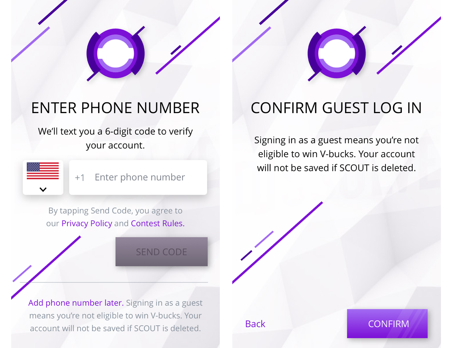
Because of the added risk of scammers, we changed sign up and log in from only collecting emails to authenticating and linking their phone number as well. New users would know nothing else. Long-time users would need to link their accounts. Users could still use SCOUT without linking their phone numbers, however, they would not be eligible to win V-Bucks. We added guest log ins later on because we wanted to capture the drop-off.
Social
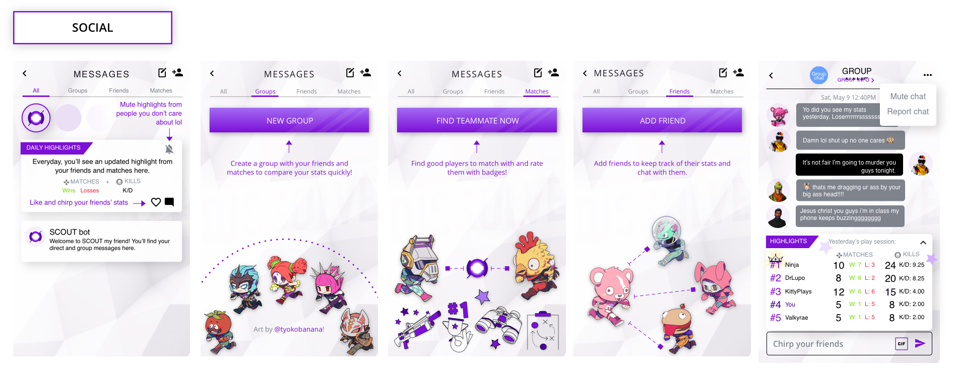
Social themes kept coming up in our surveys and interviews. We wanted to test whether SCOUT could be the chosen destination for all their Fortnite social activity. We wanted users to feel connected with their friends and spark conversation. Although there was interest in the friend feature (40% click-through rate), people didn't add as many friends as we expected to. During interviews, I found that they didn't want to add their existing friends. Instead, users were interested in meeting new people by matching.
Social themes kept coming up in our surveys and interviews. We wanted to test whether SCOUT could be the chosen destination for all their Fortnite social activity. We wanted users to feel connected with their friends and spark conversation. Although there was interest in the friend feature (40% click-through rate), people didn't add as many friends as we expected to. During interviews, I found that they didn't want to add their existing friends. Instead, users were interested in meeting new people by matching.
Onboarding
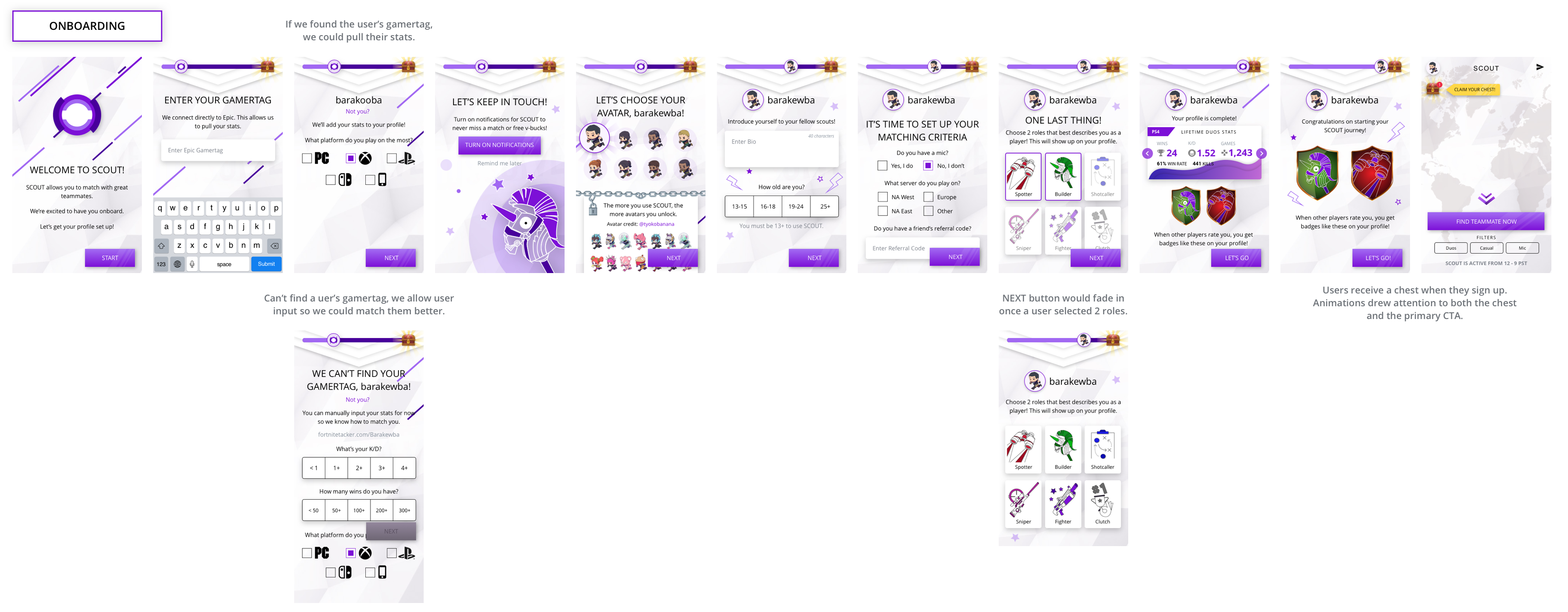
Because there was an influx of users on the platform from the V-Bucks drops, soft launch social media ads, and app release in both Apple and Android, users may now be reaching the app without any context on what SCOUT was. We saw an increase in sign ups and a decrease in match requests. The hypothesis was that new users were unsure of the benefits of SCOUT and therefore did not press the button.
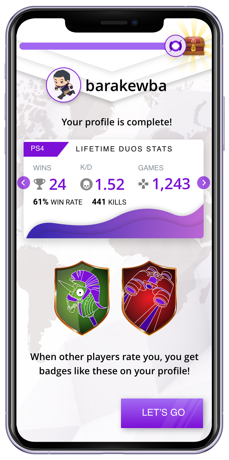
To solve this problem, I designed an onboarding flow that guided new users through creating a profile on SCOUT during when they signed up. The team was concerned that the number of onboarding steps would cause churn in the funnel. I argued that these were necessary in ensuring new users saw value right away. Although there were many steps, each page felt like they were making progress.

CHALLENGES
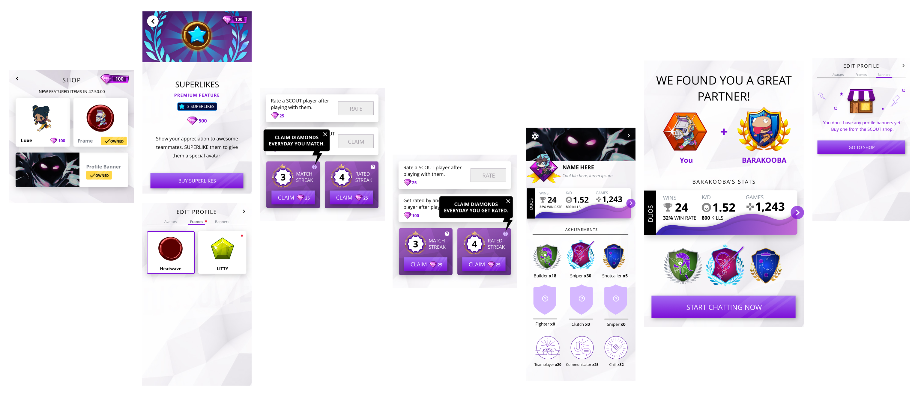
I designed an incentive model where users could earn chests by completing challenges. We wanted to drive re-engagement with clear value propositions and simple actions to complete. Valuable actions we wanted users to take were to invite friends, enable notifications, match request, and rating. When the user completes a challenge, a red dot would animate in to draw the user's attention. Accessing the challeges screen showed the user the list of challenges and available chests to claim.
Out of new users, 74% viewed the challenges page, 42% shared SCOUT, and 61% enabled notifications. The onboarding flow and challenges increased request matches from 43% to 75% (+32%).
The goal was to reach 70%. Our D3 retention also increased to 25%. This feature proved that scale directly improved retention. At our peak, our DAUs were at 2k and we matched 1k unique users a day.
Monetization
Boosts and superlikes were our first experiments in monetization. Analysis showed that our offerings were attractive, but ultimately were low in $ value.
Simultaneously, we also experimented with expanding what type of content were in drops. We know from feedback that users love custom avatars. We rewarded users when they rated N times. 75% of users that unlocked an avatar proceed to update their default avatar & rating conversion has 2x’d since tying it to avatars.
BOOSTS
Users saw a green lightning icon when they logged in. Tapping on it gave them a quick introduction on what a Boost was. Boosts notified great out-of-queue matches (limited number of times) and brought them back in the app. We believed this was true because in previous experiments, we verified that users would indeed come back from out-of-queue, match, chat, and upvote. We knew this was true by the number of people who "opt-in" and "get more" when the Boost is over.

SUPERLIKES
I experimented with the different interactions for superliking a teammate. Superliked users unlocked a special custom avatar. Superlikes are displayed on every user's avatar in messages. During interviews, I found that superlikes were being traded like currency. Users valued the custom avatars so superliking felt serious. It was about deepening friendships. We knew this was true by the number of users who superliked matches or "get more" when they run out of superlikes

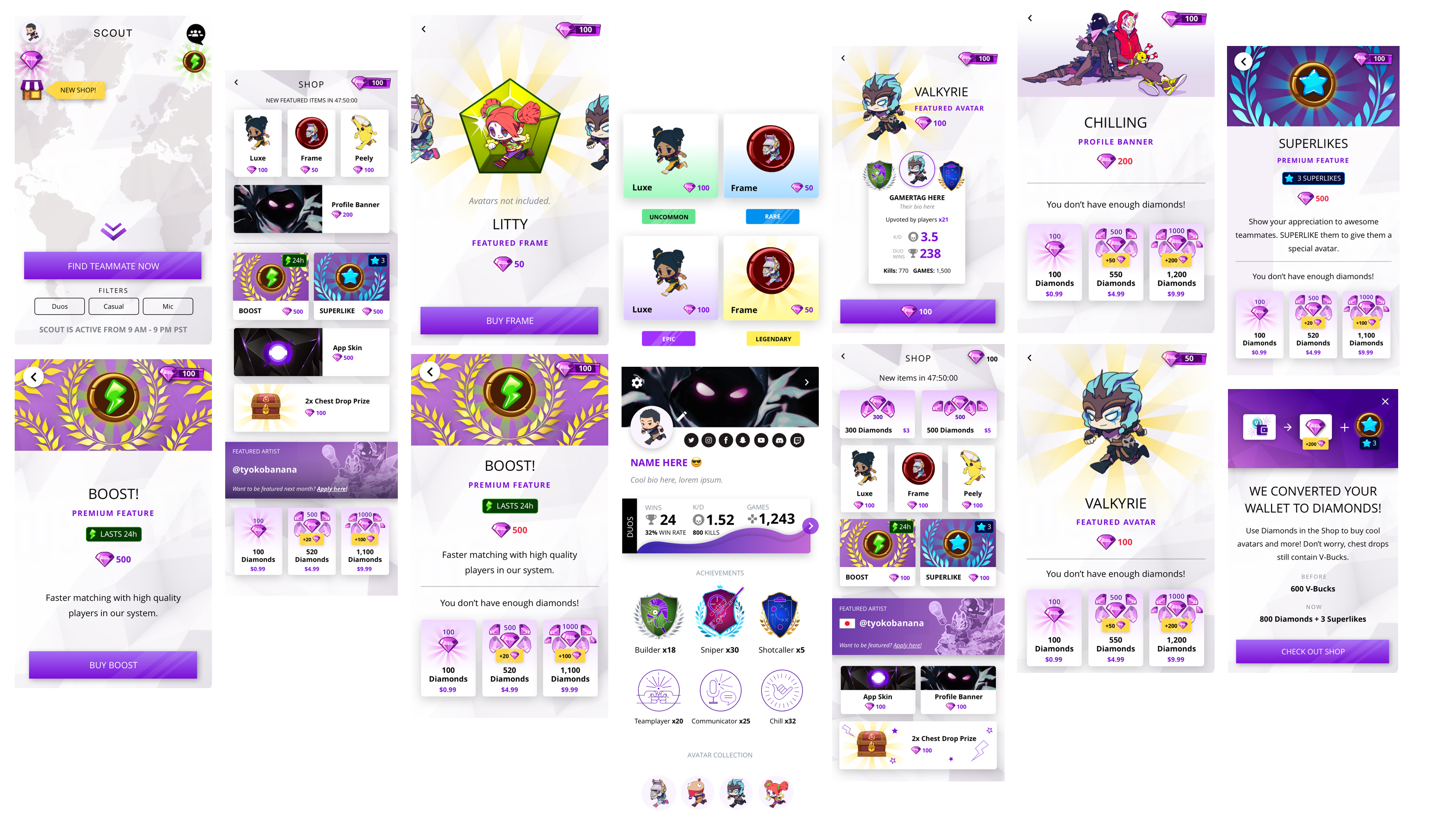
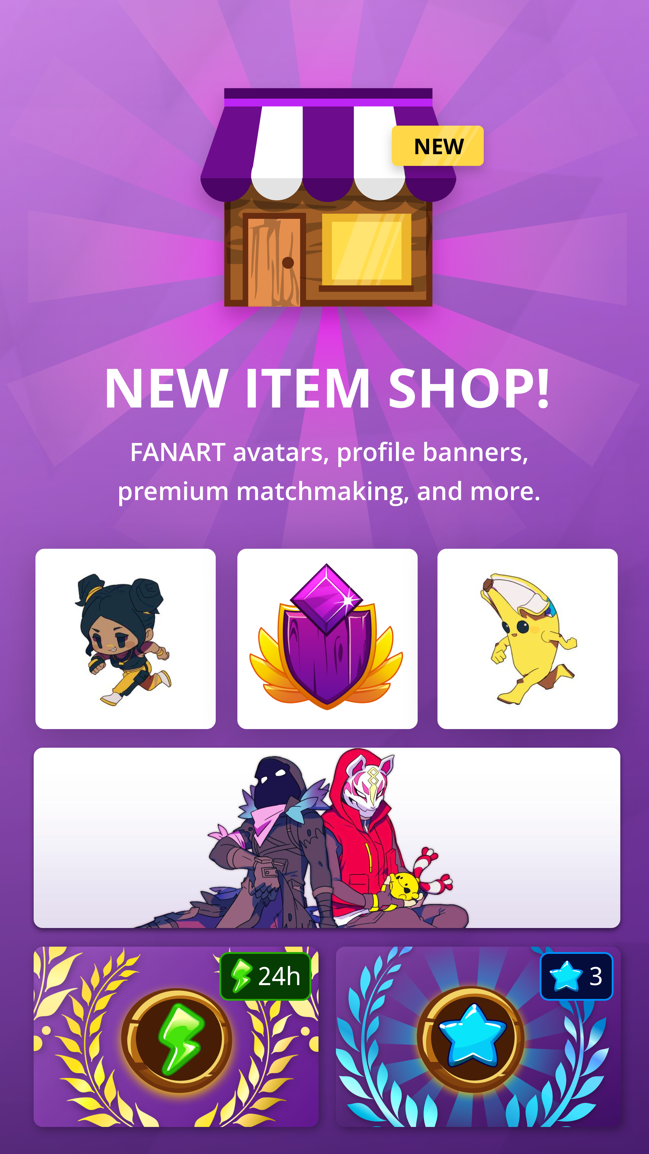
SCOUT ITEM SHOP
To create a sustainable and engaging monetization model in SCOUT, we needed to understand what items users found valuable and which items fell into a subsciption model vs. IAP model.
The experiment offered users the option to buy items they want from the SCOUT shop. Users could buy items by using diamonds, which are earned by completing challenges or buying them with real money. Items in the store would refresh every 48 hours. It included avatars, banners, boosts, superlikes, and premium profiles. Onboarding challenges no longer gave out V-Bucks, but diamonds. We converted users' collected V-Bucks to diamonds.
I designed the shop to look exciting. Users could access it via the homepage. The incentive and gamified system were finally connected. We wanted to learn if users would use real money in order to get premium items and if users would complete and ask for challenges to earn diamonds for these rewards? The custom avatars were a hit with our users.
Pragmatic User Research
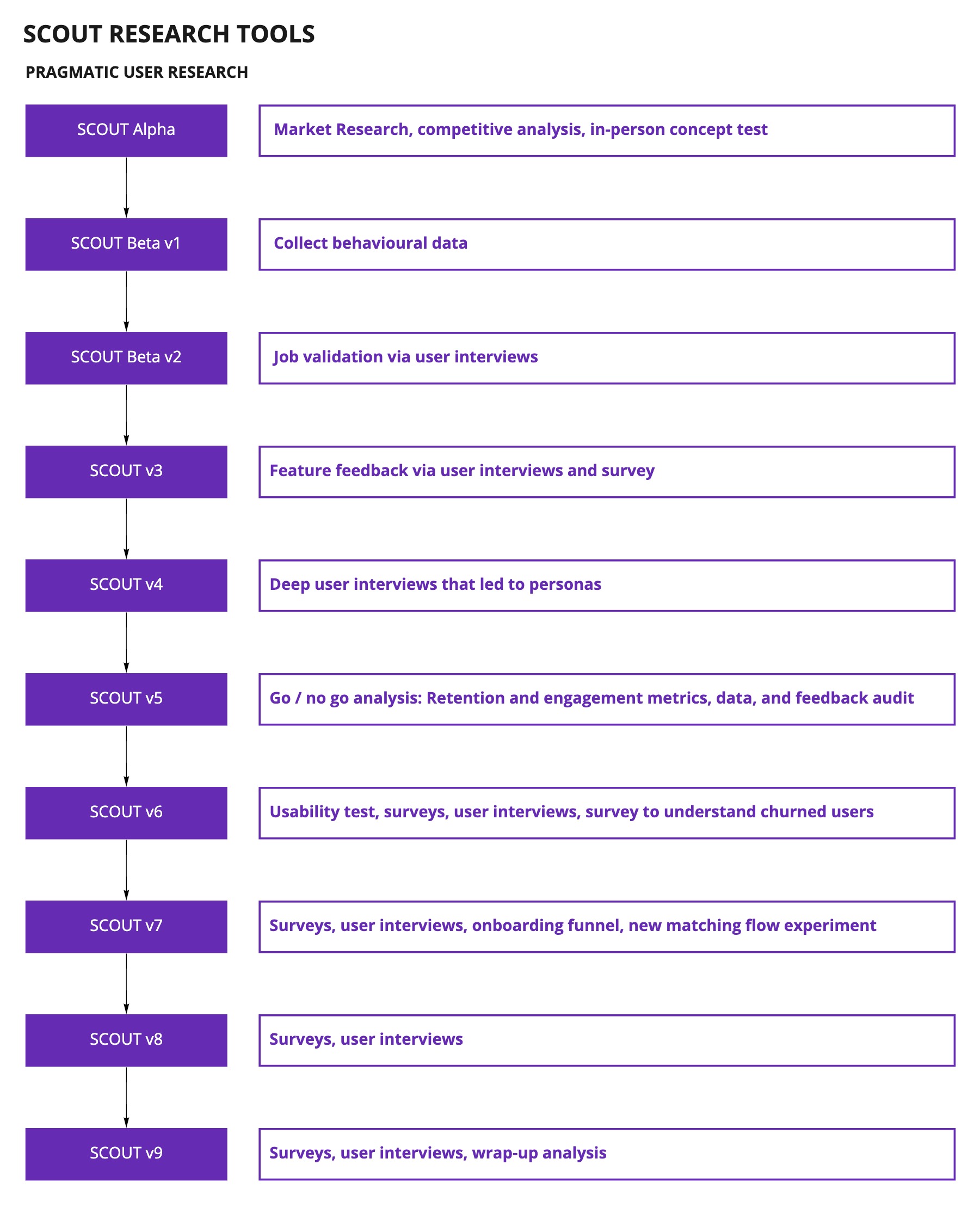
The misconception in Battlefy was that user research would be expensive and that it would take too much time. I proved the value of user research to the leadership team and company through SCOUT by showing the team how learnings directly impacted the product. Pragmatic user research is about choosing the right tools to maximize your learning outcomes.
Every product team needs to move fast. We must be efficient when it comes to decision making. But SCOUT was a completely new product. We didn’t have any behavioural or previous data to rely on. Additionally, the lack of user research and feature validation was one of the biggest challenges that the company had. In product, we wanted to deliver the best solution possible in the shortest amount of time possible. This is why we relied heavily on user research, and being creative on how to do it even with tight timelines.
Taking the time to conduct user research saves us time and money in the long run by providing the information we need to make the right decisions more quickly, producing better designs that require fewer changes, and delivering a more successful product.
Understanding our users gave us the confidence of knowing where to start, what experiments were worth running, what features were worth building -- because there are many great ideas but if we want to learn as quickly as possible, we must build products that resonated with our target market.
Hypothesis-driven approach
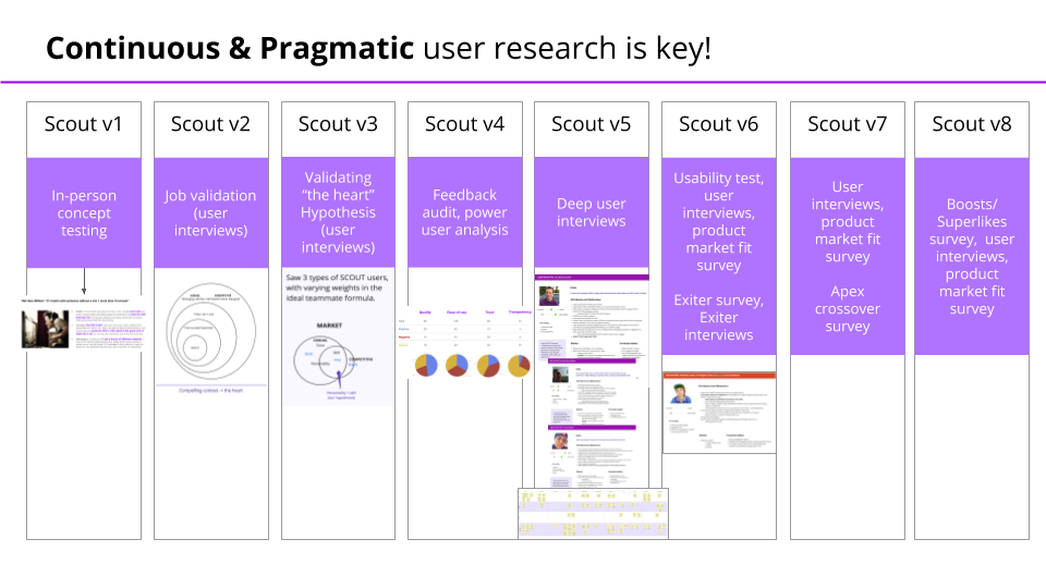
We had a lot of assumptions going in, especially about who our users were. We took a hypothesis-driven approach to maximize our learning outcomes. What we learned from the previous version/s directly informed the next. We used these tools to validate and invalidate our core assumptions in a pretty short period of time, and the impact was huge. Small samples at a time, big stories.
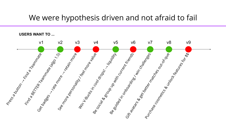
Iterative Process
SCOUT was the most challenging project I've ever worked on. I tackled small and big problems that ultimately led to true user love. This was the ideal partnership with a PM and engineering team. We chose the problems that we heard directly from users and synthesized from data. There was a true marriage of quality and value. I am grateful to have worked with an amazing team; key people I wanted to mention again: Sam Bremang, Colton Arabsky, Eric Leong, Dmytro Iefremov, and Tad Huang.
Because SCOUT was operating as a startup within a startup, we were designing our processes from the ground up. By optimizing our workflows, we were able to deliver high quality app versions with barely any delays in realeses. After we sunsetted the app, we did a post mortem of the entire year's worth of work. We wanted to take our learnings in product development and spread that knowledge to the Battlefy teams. We presented our approach and workflows to the company, and implented them in our project teams moving forward.
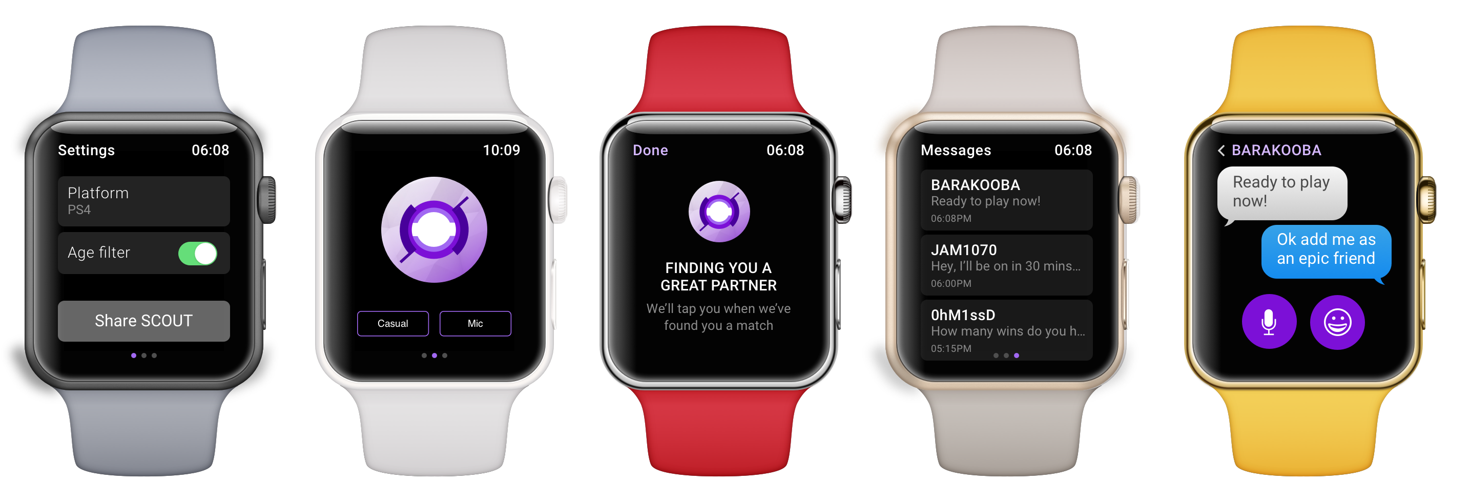
Apple watch concept for the Apple Store pitch deck.
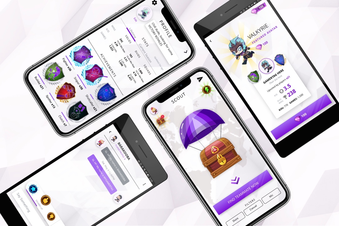
Learnings
In the early days of SCOUT, we debated constantly if we needed to prove retention before scaling. Scale and liquidity were main drivers of retention. In our desire to move fast, we tackled one hypothesis at a time and conducted research pragmatically. There were hints of how important social and friendships were in SCOUT. We were also focused on DAUs quite a bit, but users didn't need SCOUT everyday. Weekly retention was stronger than daily for us.
By version 5, we were sending surveys with Sean Ellis' (Dropbox, Eventbrite) product market fit framework. He benchmarked over a hundred startups and the magic number was 40%. Companies that struggled to find growth almost always had less than 40% of users respond "very disappointed," whereas companies with strong traction almost always exceeded that threshold. There were 3 questions:
- How disappointed would you be if you could no longer use SCOUT tomorrow?
- Very disappointed
- Somewhat disappointed
- Not disappointed at all
- What's the main benefit you get out of SCOUT?
- How can we improve SCOUT for you?
The benchmark was 40%. Slack = 51%. SCOUT = 60-65%.

Denise Villanueva
UX STRATEGIST AND PRODUCT DESIGNER
Denise Villanueva
UX STRATEGIST AND PRODUCT DESIGNER
Denise Villanueva
UX STRATEGIST AND PRODUCT DESIGNER
Denise Villanueva
UX STRATEGIST AND PRODUCT DESIGNER
Denise Villanueva
UX STRATEGIST AND PRODUCT DESIGNER
