Unbounce Academy
A self-service learning hub that empowered customers to quickly find answers, dramatically cutting down support tickets.
Problem
Unbounce's self-serve customers were having a difficult time finding the information they needed online. Unbounce had good educational content and technical documentation--but there wasn't a singular place where customers could access these. Internally, the CS (Customer Support) team found it challenging to refer customers to the appropriate articles.
Goals
Give self-serve customers a way to get information without sending in a support ticket, which could take a few hours to respond to. We wanted to ultimately decrease the number of support tickets that were frequently asked and common questions.
Give self-serve customers a way to get information without sending in a support ticket, which could take a few hours to respond to. We wanted to ultimately decrease the number of support tickets that were frequently asked and common questions.
Solution
Unbounce Academy is a holistic educational platform for both new and existing customers. The overarching goal was to reduce the company's churn rate by providing customers with "how-focused" and "why-focused" content, delivered through a unified experience for our customers.
Results
Support tickets on high level questions such as "What is a landing page?" or "How do I do X in the builder?" have decreased significantly. The community managers now have an Unbounce Experts program where long-time Unbounce customers help answering app related questions and give feedback to new marketers on their pages. CS can now direct customers to accurate and helpful articles, which in turn boosts the team's morale and customer satisfaction rating.
Support tickets on high level questions such as "What is a landing page?" or "How do I do X in the builder?" have decreased significantly. The community managers now have an Unbounce Experts program where long-time Unbounce customers help answering app related questions and give feedback to new marketers on their pages. CS can now direct customers to accurate and helpful articles, which in turn boosts the team's morale and customer satisfaction rating.
Process
Information Architecture
I first focused on the information architecture. In order for me to understand how a user might interact with technical articles, I started with the question "how might we design a great experience for information-seeking behaviour?"
Through research, customer interviews and stakeholder interviews, we were able to determine the main pillars: Community, Documentation, Workshops, and Ecourses. We found out that users would rather search for information (73% of traffic to business sites come from organic search), rather than learn the navigation of the site so we emphasized the search functionality in each pillar. This allowed users to find the information they needed quickly.
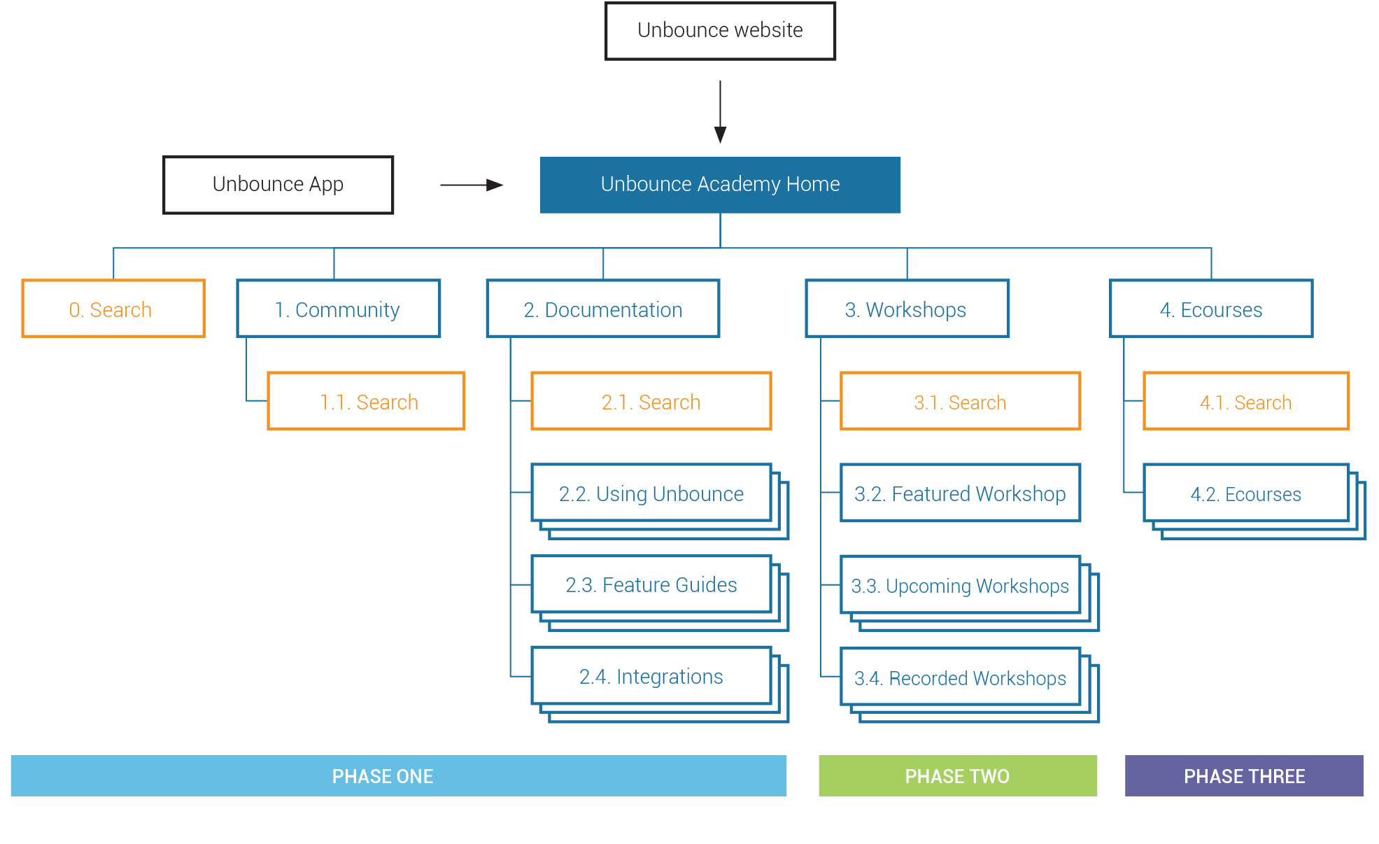
We mapped out the entire ecosystem so that the team had alignment on the vision of the experience. This informed the decisions and compromises we made along the way. Working with key stakeholders, we agreed on product requirements and mapped out where they could live within the ideal workflow. This allowed me to document opportunities for the platform.
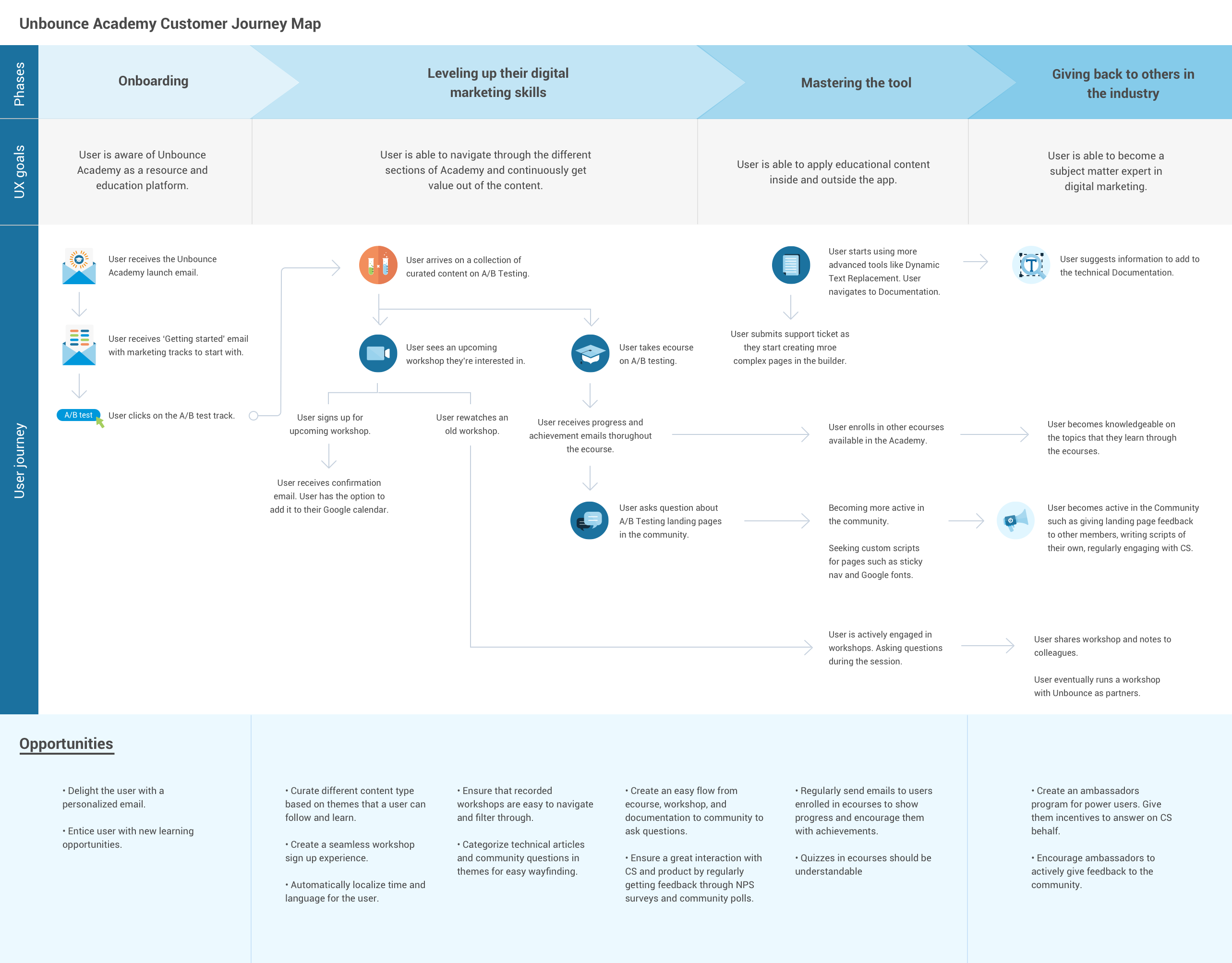
After getting feedback from stakeholders, I collaborated with the UI Developer on the project to determine what was feasible to build within the project timeline.
Wireframes
Wireframes
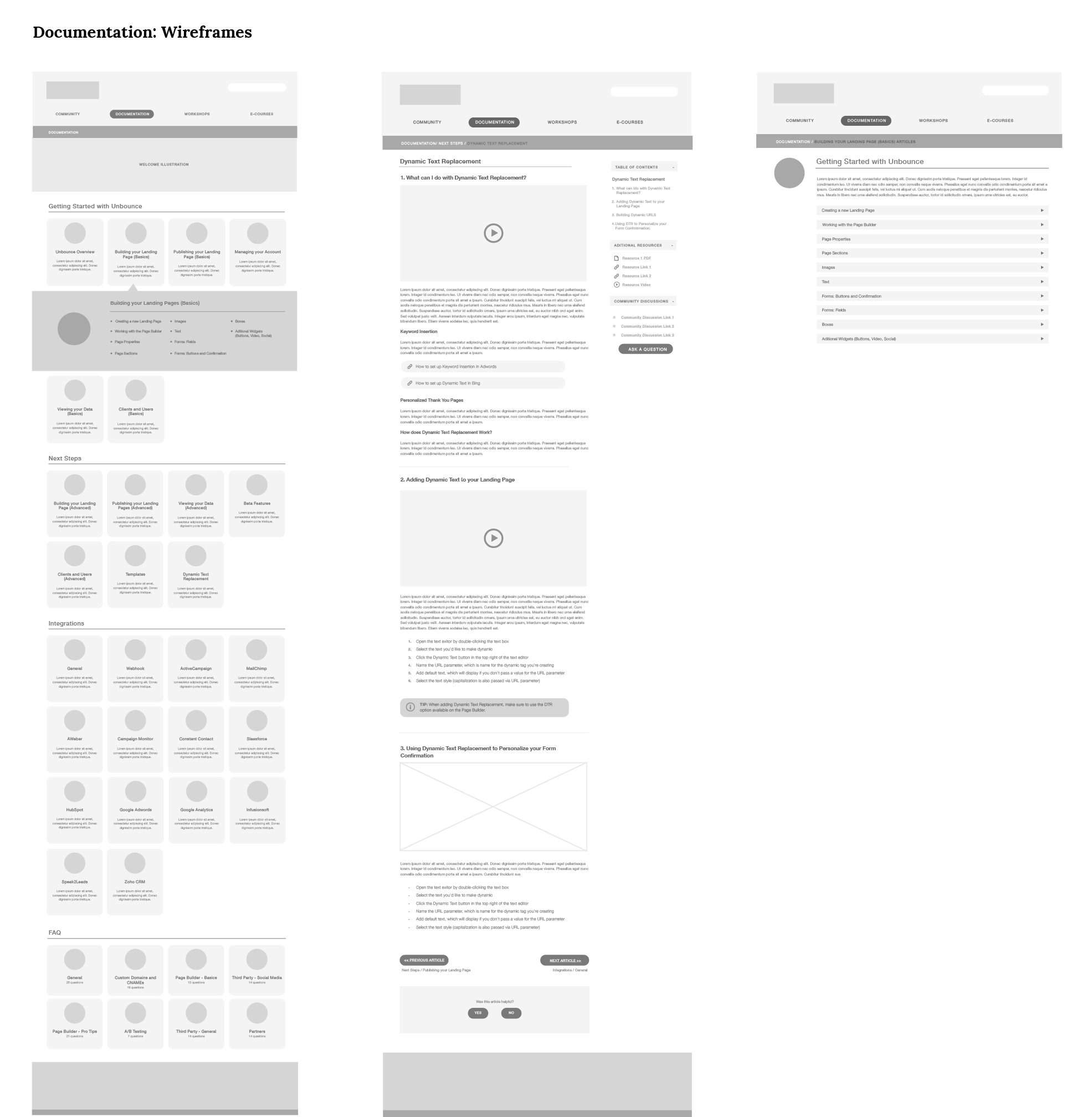
The intent behind the wireframes was to identify risks at an early stage. We conducted usability studies for Documentation, Workshops, and Ecourses as well as regularly getting feedback from stakeholders. After multiple iterations, we were able to define what our MVP would look like for each section.
DOCUMENTATION
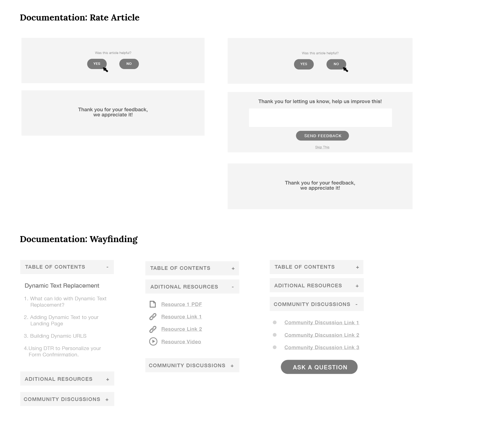
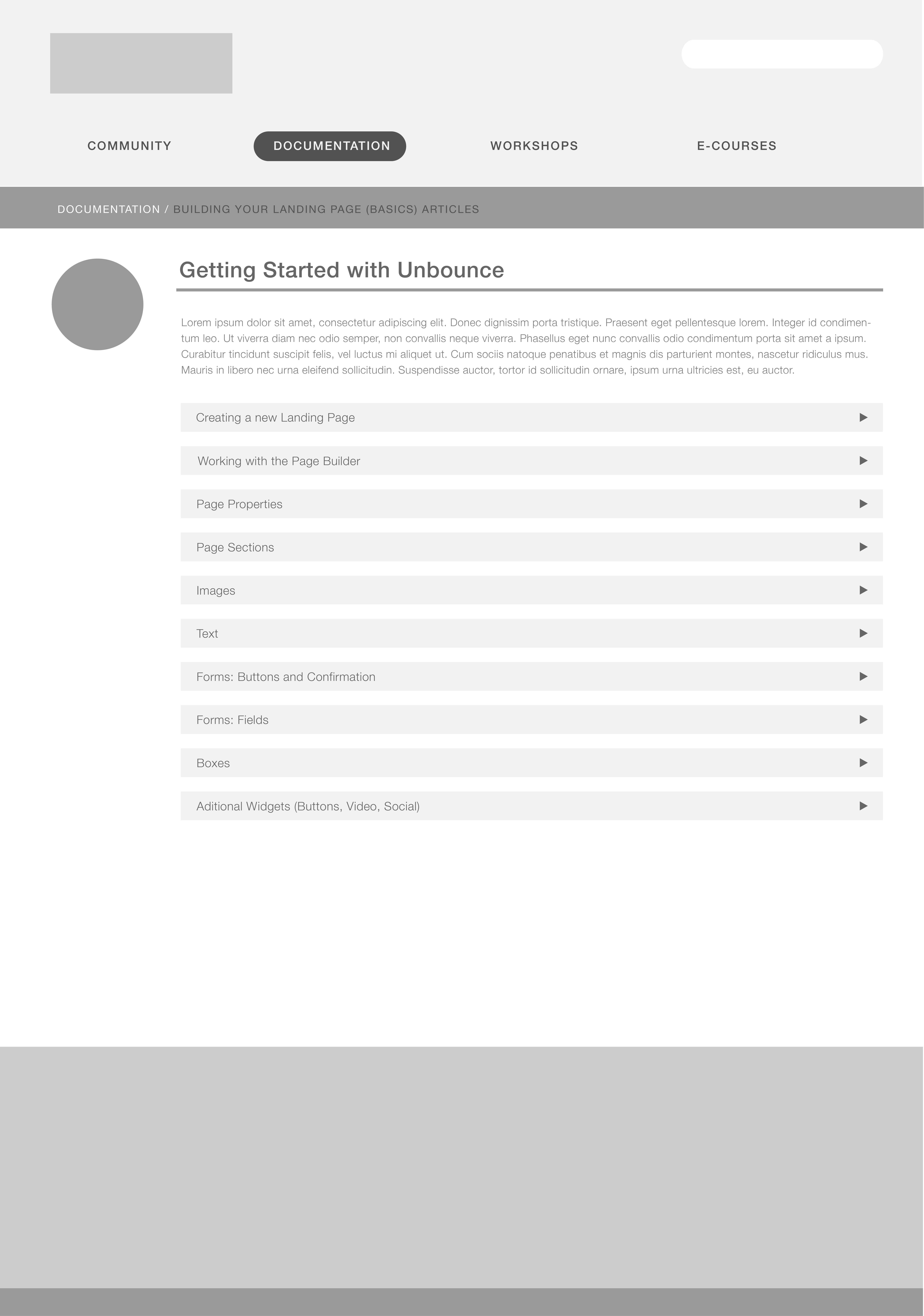
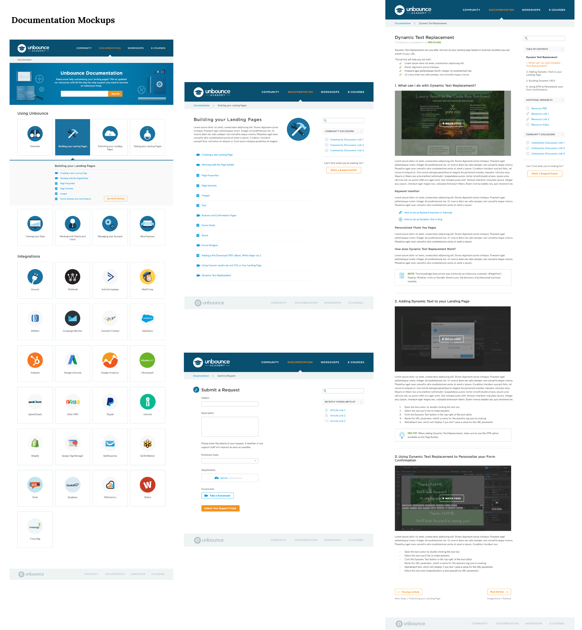
The goal for the Documentation section of the Academy was easy wayfinding and findability.
In the usability study, we found that users were having a difficult time finding the articles we asked them to locate. Half of the participants said that they usually search for items rather than browse different categories. We took their feedback into account and added a global search above the fold to align the design with their mental model of a help centre. When asked to find articles (without using the search), the categories proved to be useful as users were able to complete the task without a problem. Wayfinding within each article also tested well as it clearly showed where the user was and they knew what to expect next.
WORKSHOPS
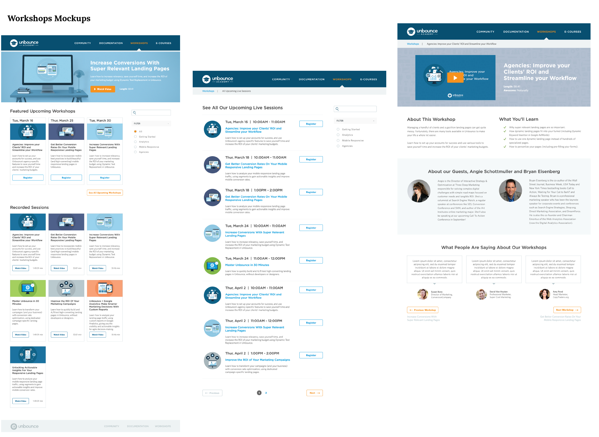
Workshops had two goals: 1. Deliver "how-focused" and "why-focused" content to the user regularly in an easy-to-understand format and 2. Measure interest by evaluating leads collected for a workshop, use this data to improve on content.
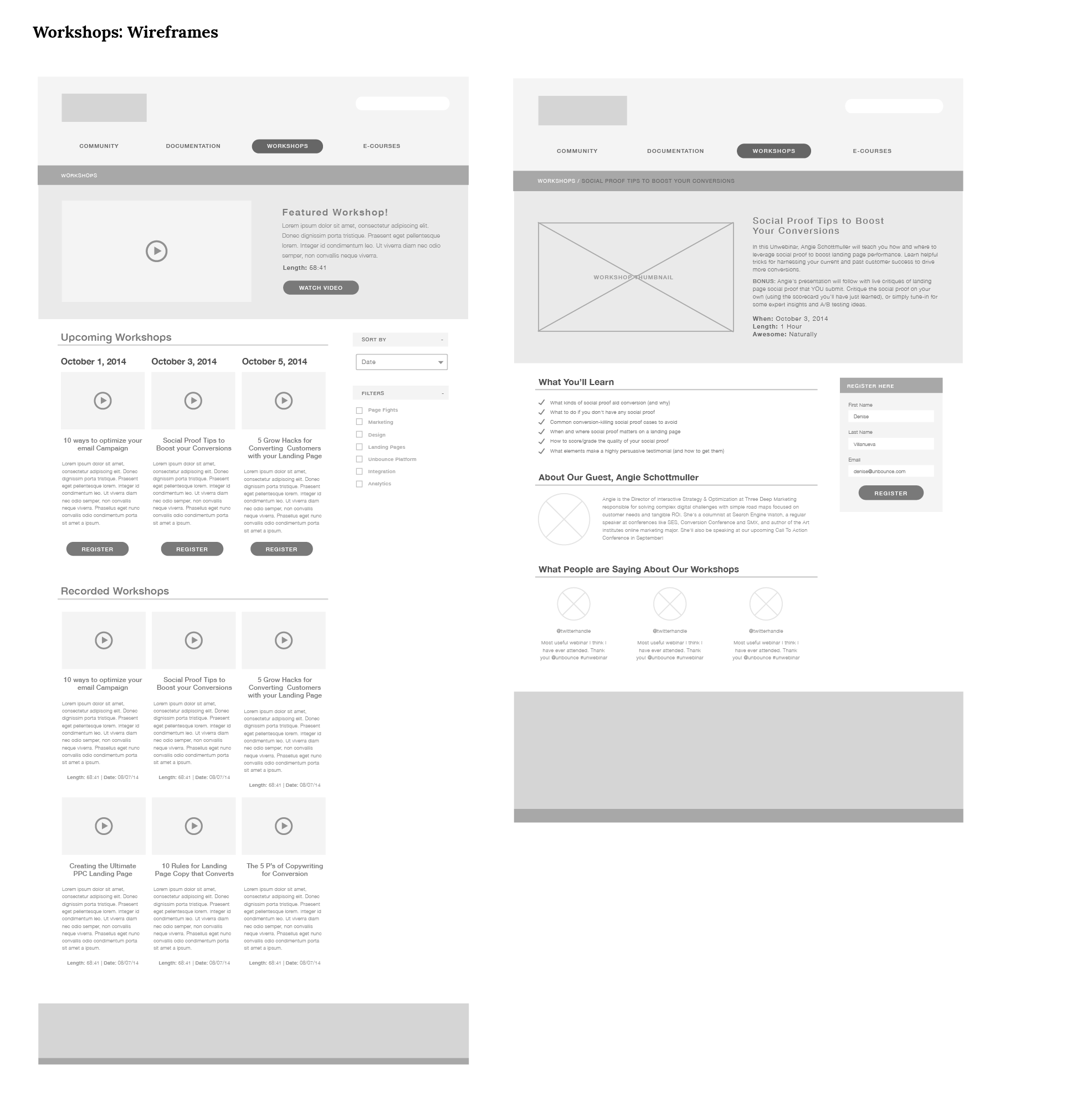
From the usability tests, we found out that users liked the idea of being able to watch previous recorded workshops but they wanted to organize it by topics, not by date. We added the filter on the right, similar to Documentation's wayfinding design, so that users are able to quickly select topics that they're interested in.
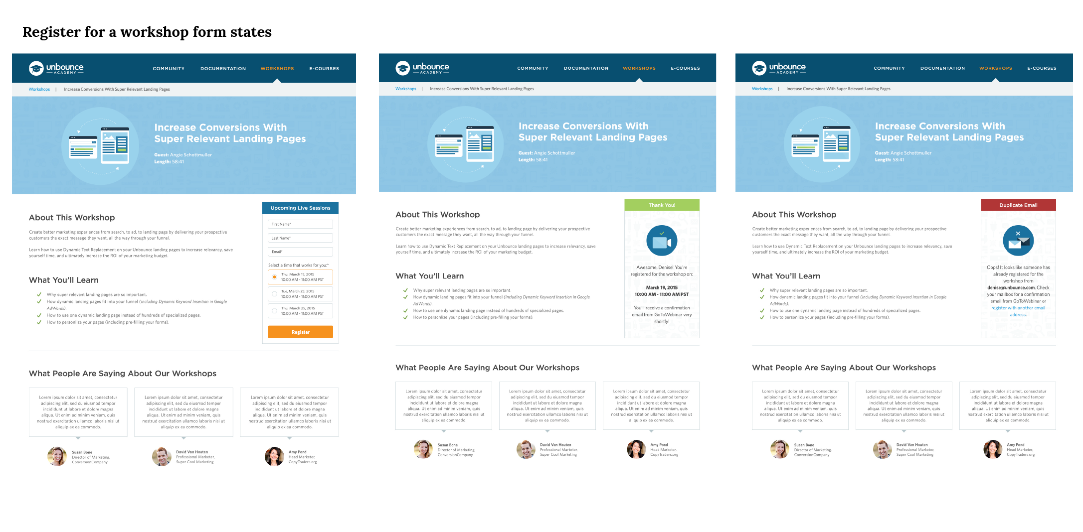
As you will later see in the final mockups, I designed a page where users are able to see all upcoming workshops, not just three. And because workshops present an opportunity to collect leads, we optimized the form by localizing the time as well as giving instantaneous contextual feedback. Users are also able to "save a spot" from the Workshops homepage.
ECOURSES
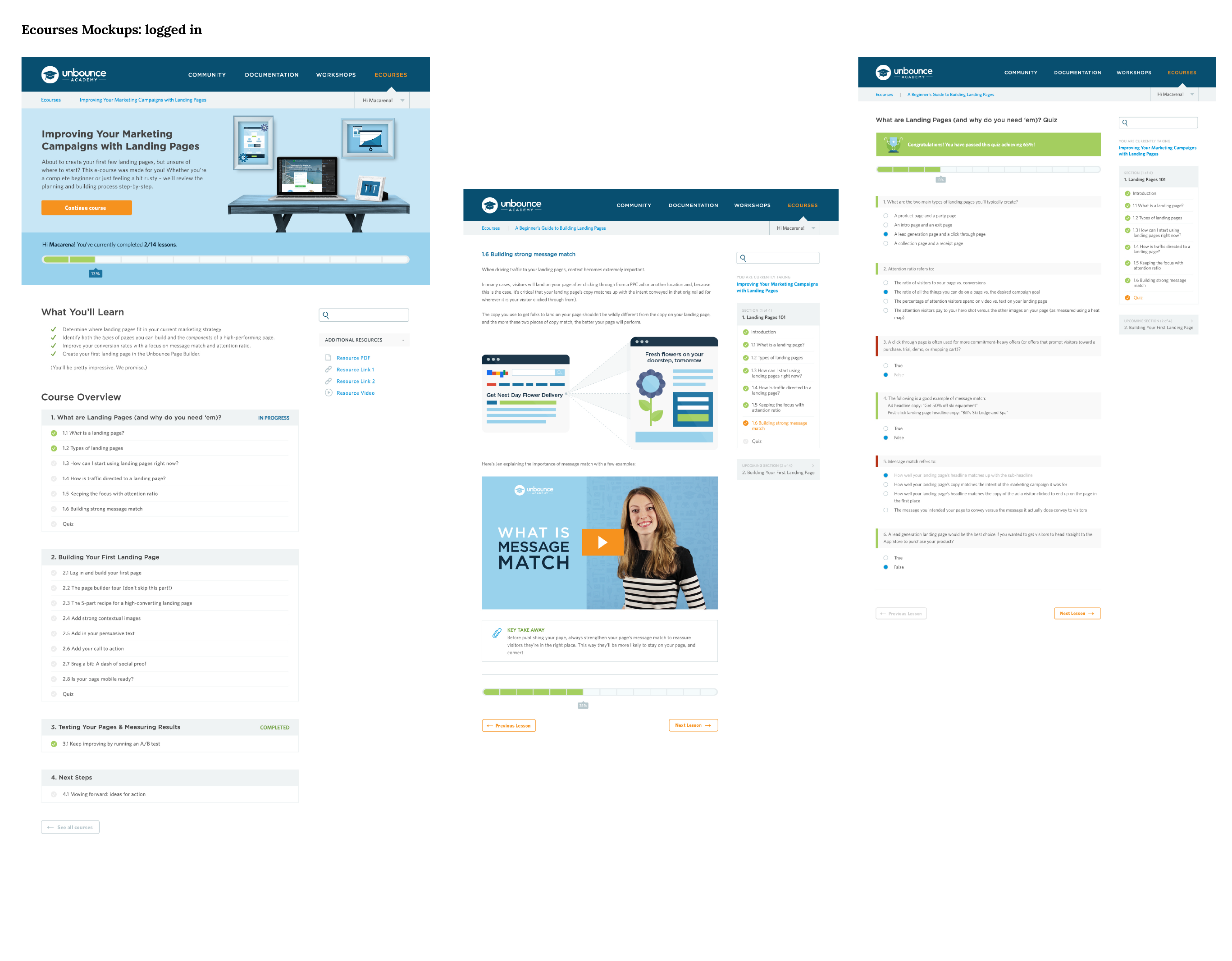
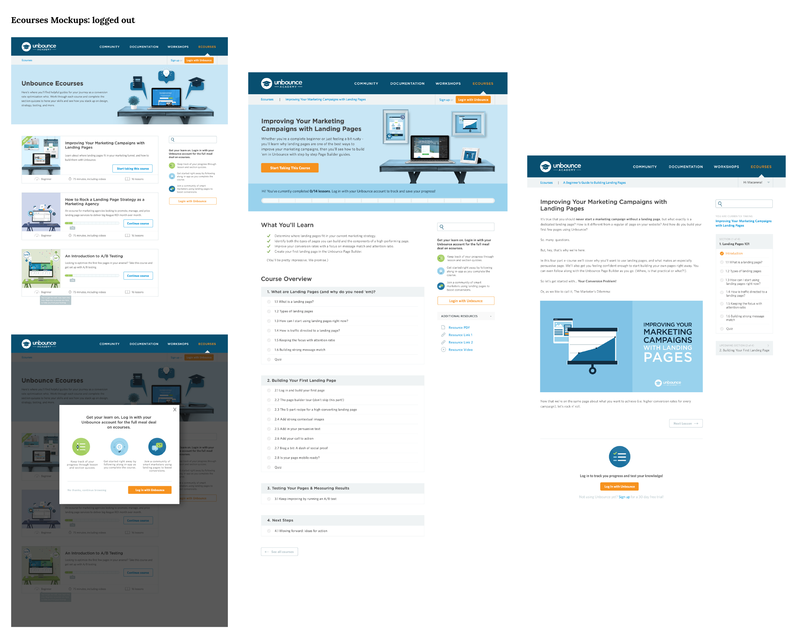
Ecourses proved to be the most challenging of all of the sections. The goal of this section was to 1. Like workshops, provide actionable content, specifically on how to become an Unbounce power user and 2. Encourage users to log in so that we can track their progress, reward them for their hard work, and collect this data internally and learn from it to improve future ecourses.
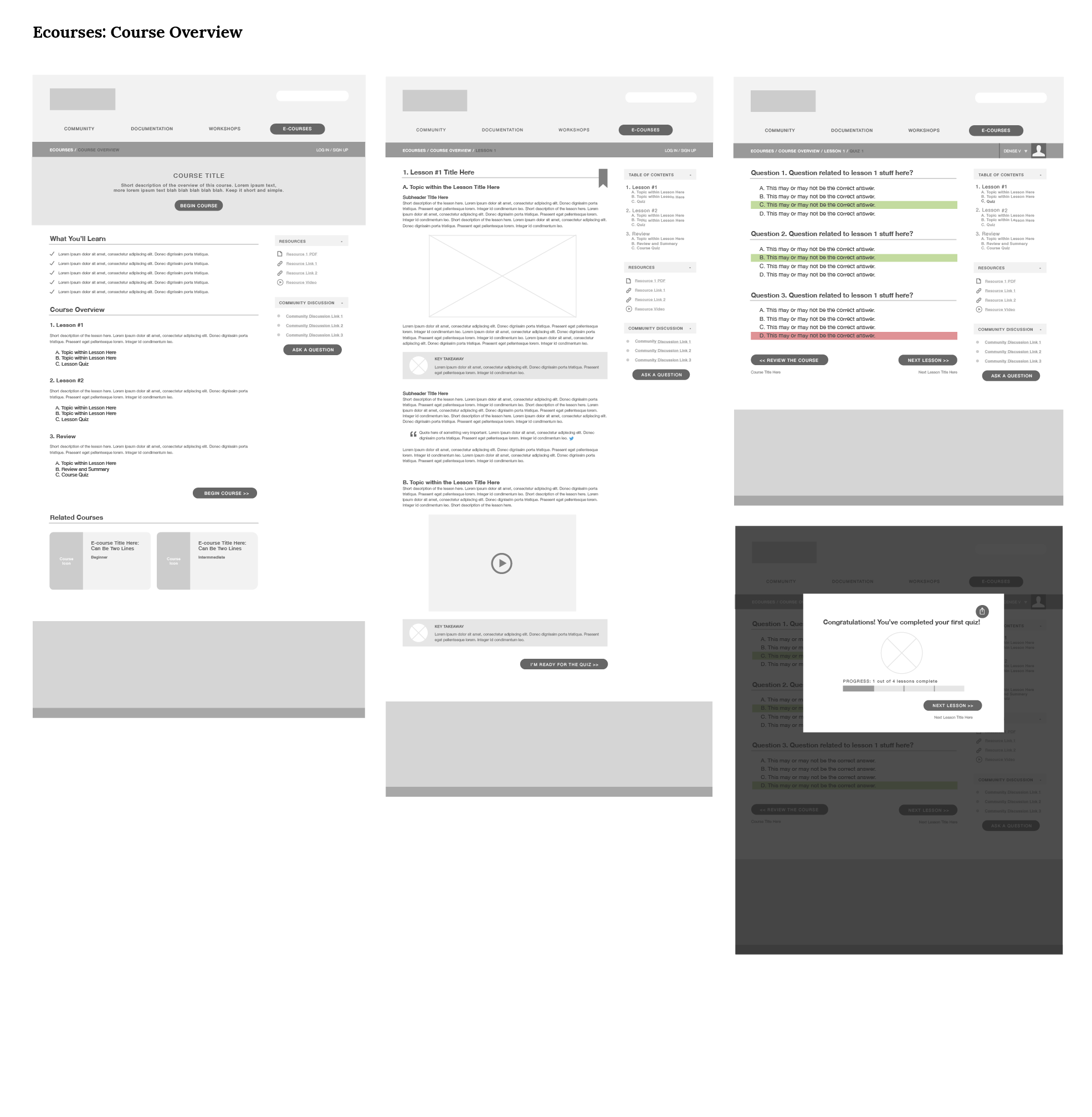
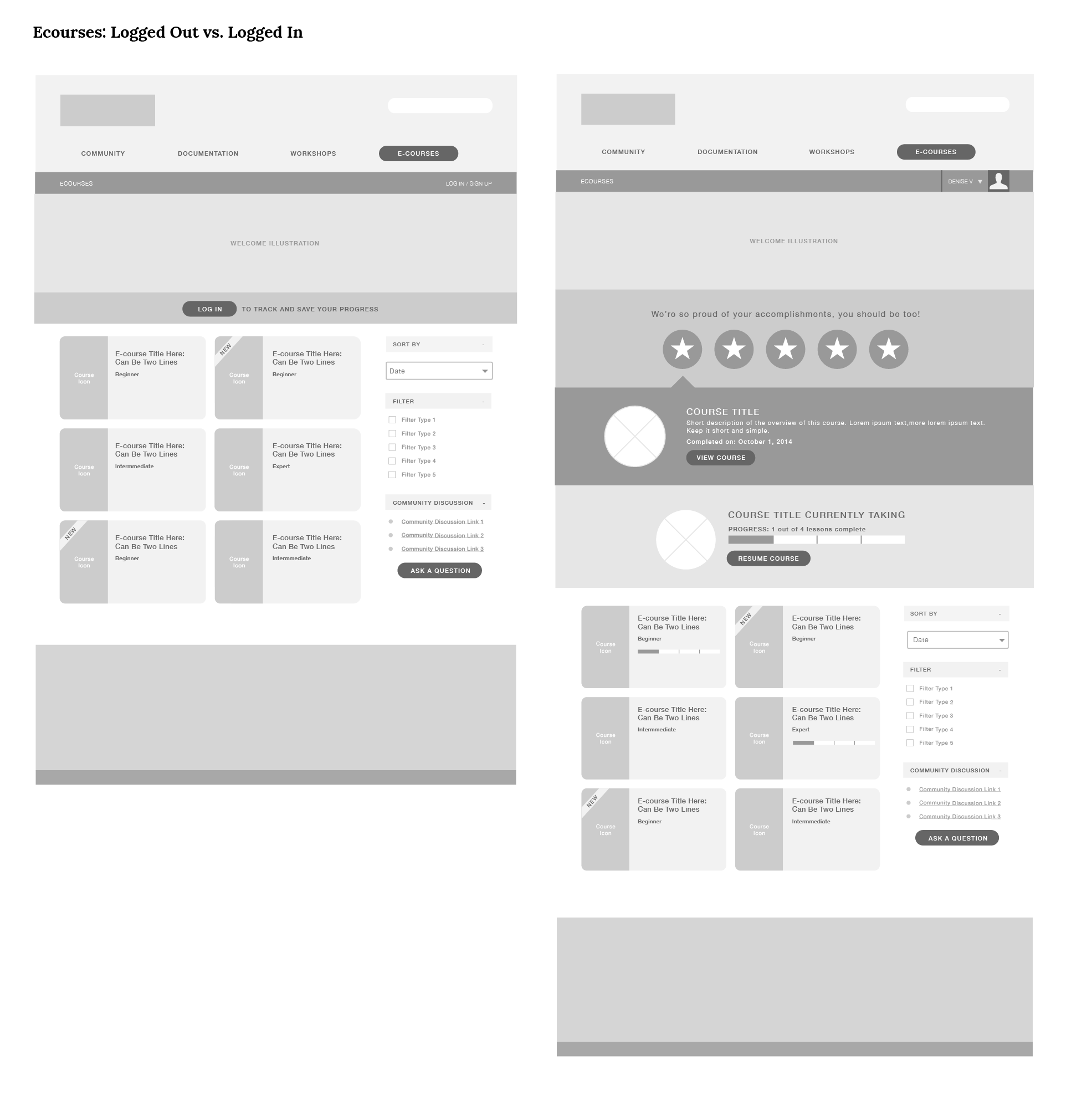
We didn't want to block a user from going through an ecourse. Instead of creating a jarring experience, I opted to prompt the user to log in when they reach the quiz and let them know that they will be able to save their progress (through SSO) and take they can then take the quiz and learn from the results. This incentivized users and we saw a quick increase in enrolled students vs. visitors.
We didn't want to block a user from going through an ecourse. Instead of creating a jarring experience, I opted to prompt the user to log in when they reach the quiz and let them know that they will be able to save their progress (through SSO) and take they can then take the quiz and learn from the results. This incentivized users and we saw a quick increase in enrolled students vs. visitors.
GLOBAL SEARCH
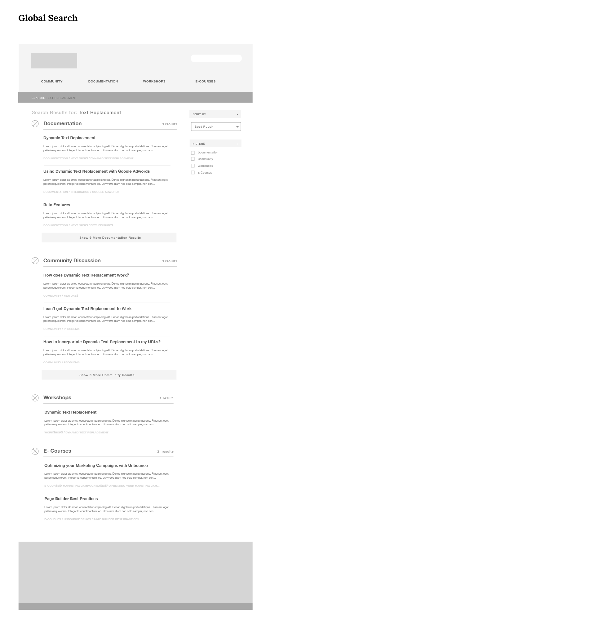
The key takeaway from all the usability studies was that search was something users consistently looked for. We added search to every section of the Academy and allowed users to see the complete list of results in a clean and structured hierarchy of information. We added breadcrumbs as well, so that the user knows exactly where this information can be found outside of the search results.
Mockups
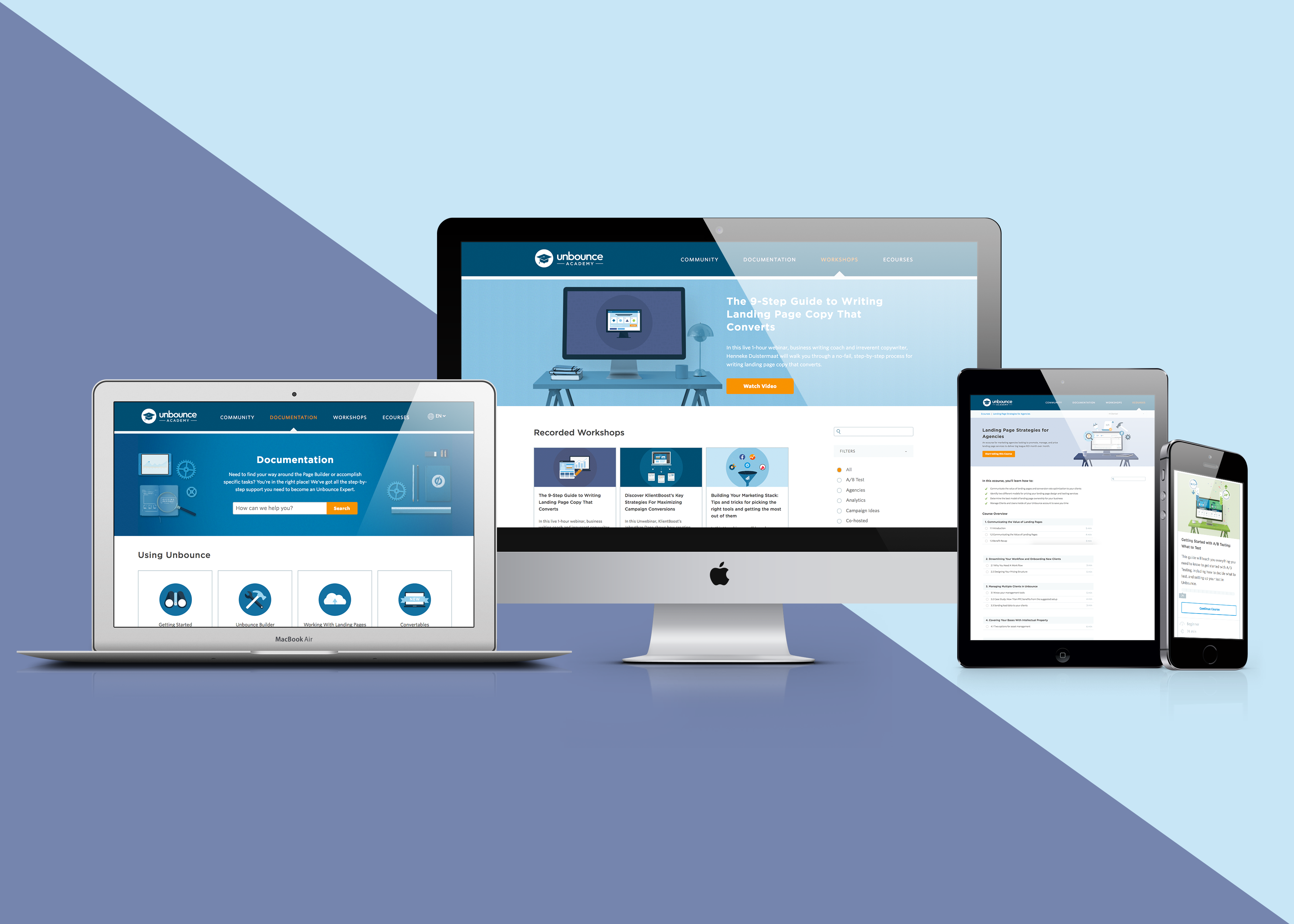
I designed mockups for both desktop and mobile.
Branding & Art Direction
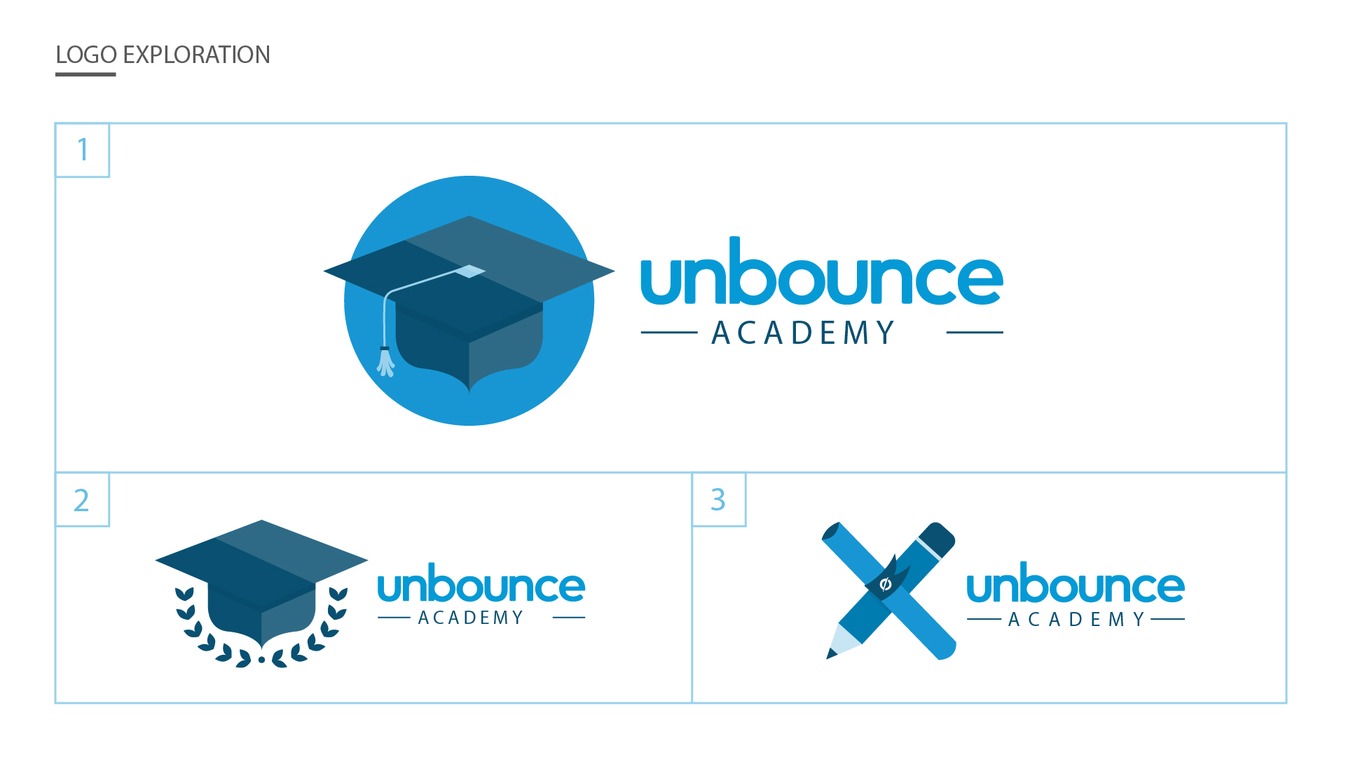
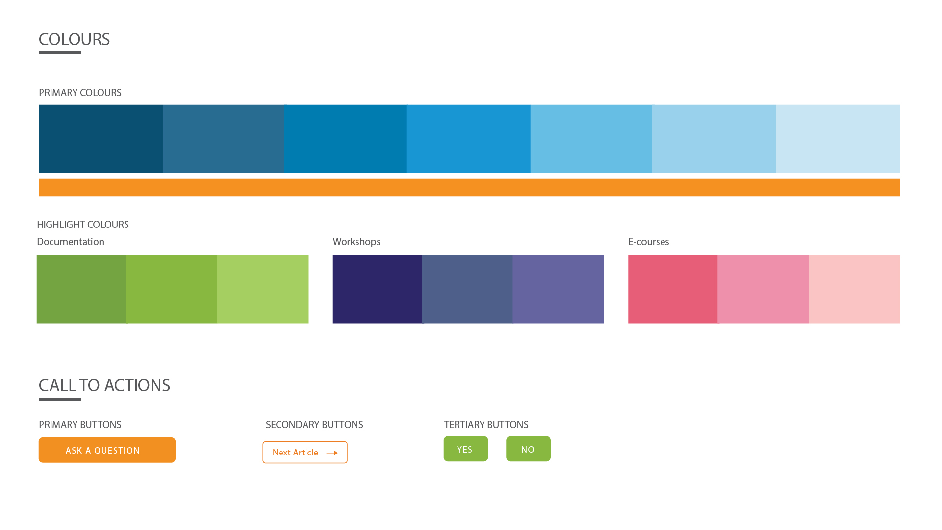
Because this was a brand new project, I had the opportunity to design the logo and the subbrand's art direction. Since there was a lot of content in the Academy, I created fun illustrations that lightened the mood. It created a professional and fun visual atmosphere.





Denise Villanueva
UX STRATEGIST AND PRODUCT DESIGNER
Denise Villanueva
UX STRATEGIST AND PRODUCT DESIGNER
Denise Villanueva
UX STRATEGIST AND PRODUCT DESIGNER
Denise Villanueva
UX STRATEGIST AND PRODUCT DESIGNER
Denise Villanueva
UX STRATEGIST AND PRODUCT DESIGNER

